Komplex Kulturmagazin Identity
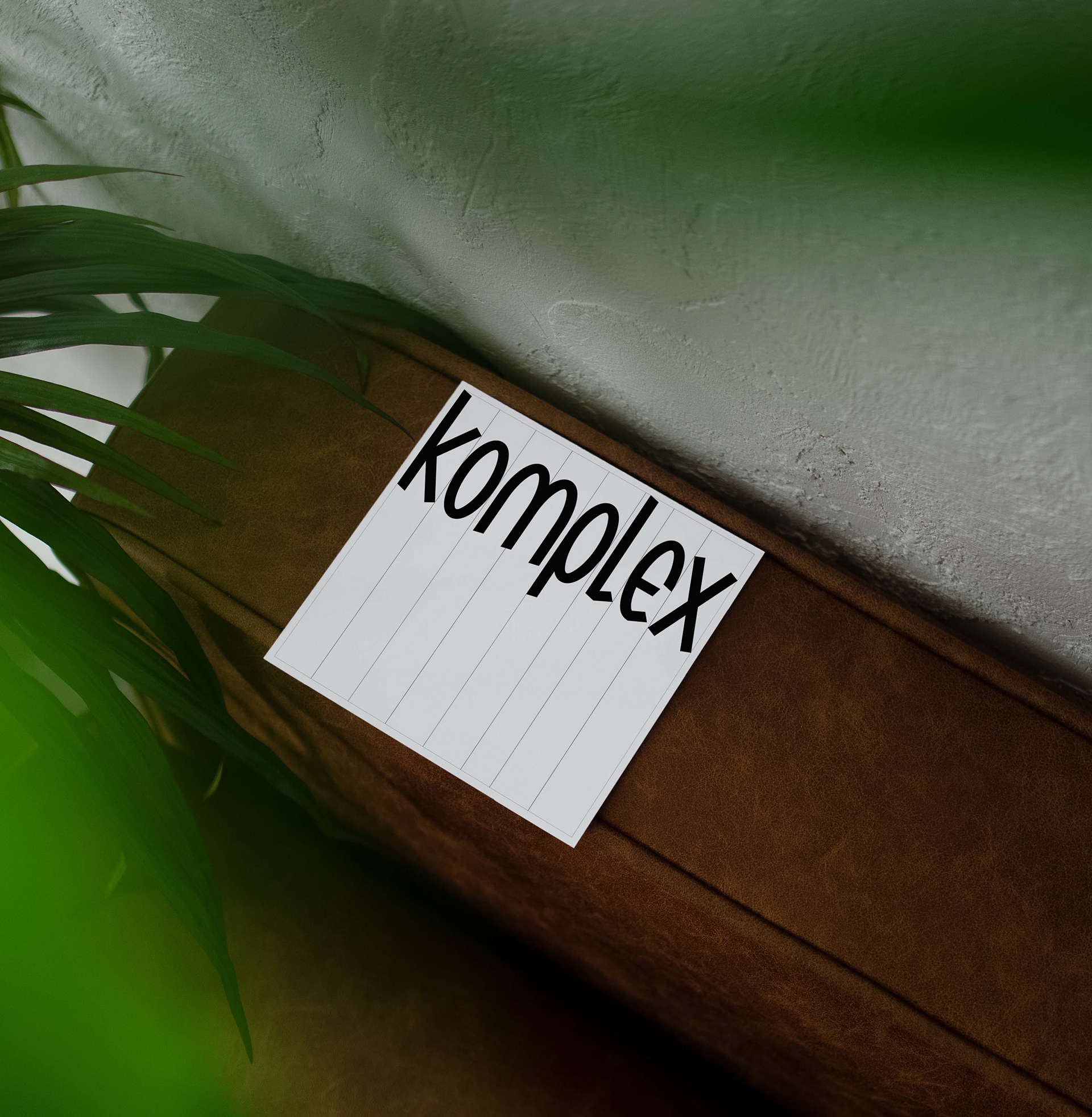
komplex Kulturmagazin began as a humble indie zine in Innsbruck. Over the past decade, it has evolved into a much-loved independent space for unconventional ideas — a platform for literature, contemporary art, culture and the unexpected. It was time for a new mark as bold and unique as their community.
The eccentricity of the new bespoke wordmark is balanced by Mulish, a functional sans-serif by Vernon Adams. Together, they create a striking tension — Mulish’s neutrality provides a clean foundation that highlights the quirky character and humour of the custom wordmark.


[unused] all-caps version