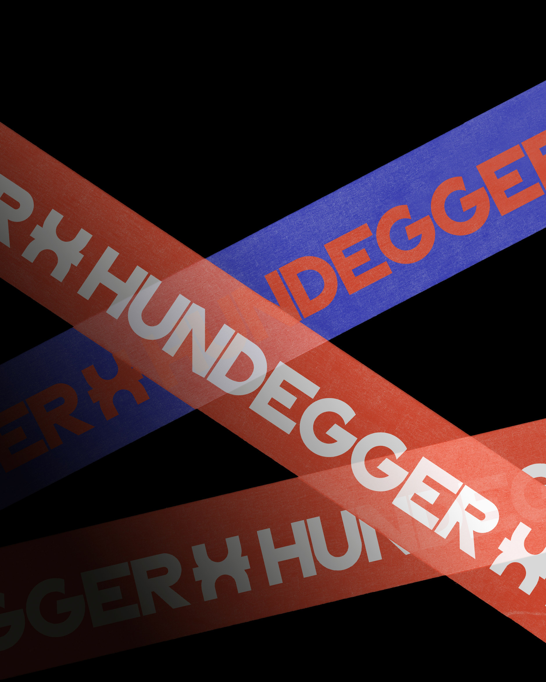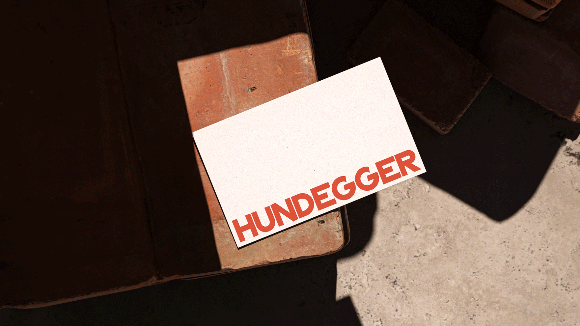
BM Ing. Hundegger Branding + Identity
The new functional and flexible identity for BM Ing. Hundegger GmbH, a family-owned construction company in Innsbruck, translates their long history into a cohesive, versatile and distinctive visual system.
Emphasizing tradition, innovation, sustainability, quality and reliability, the company collaborates closely with clients to transform their ideas into unique spaces that pass the test of time. With this in mind, the new identity builds on the existing brand, breathing new life into it and combines contemporary aesthetics with timeless design elements.
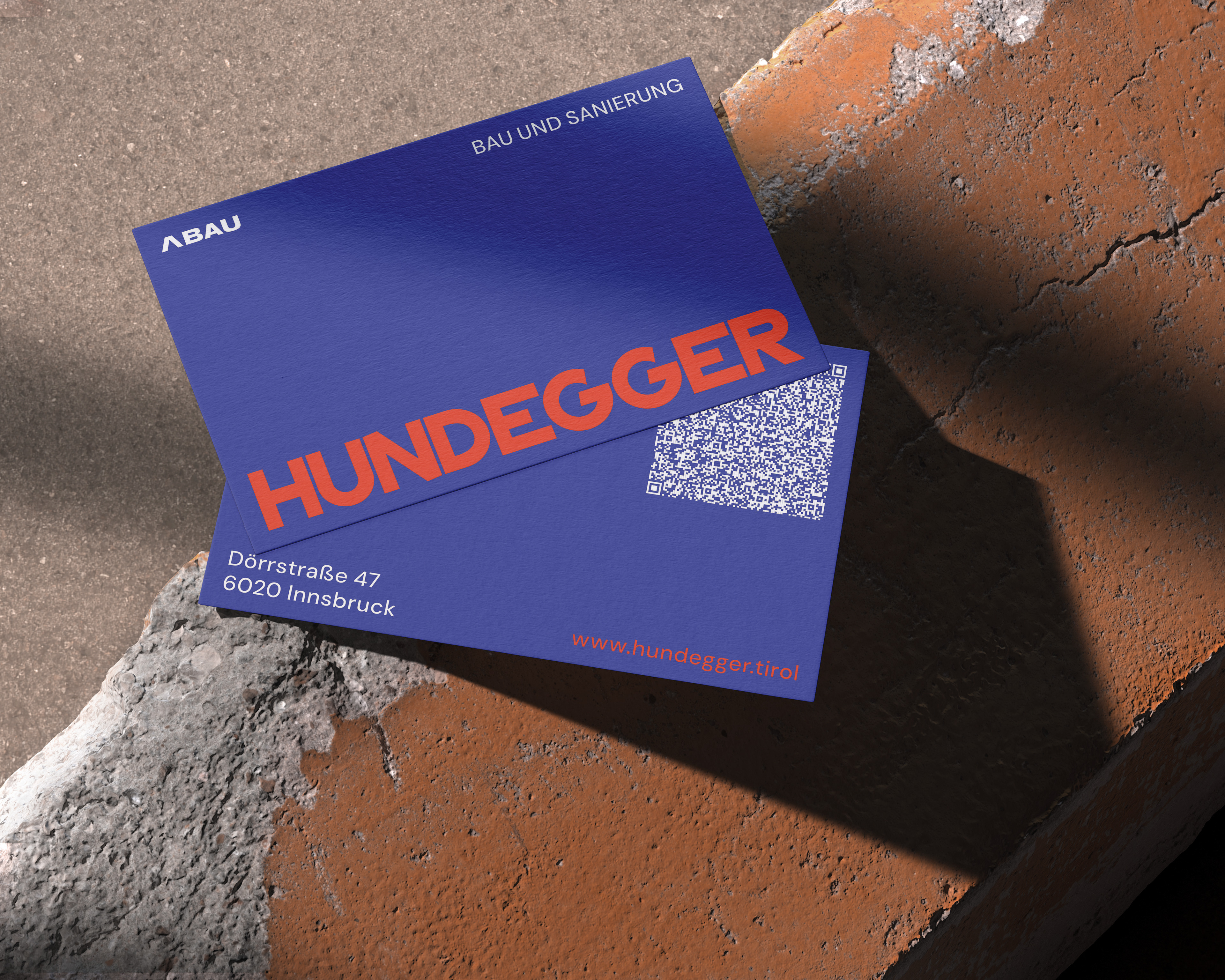
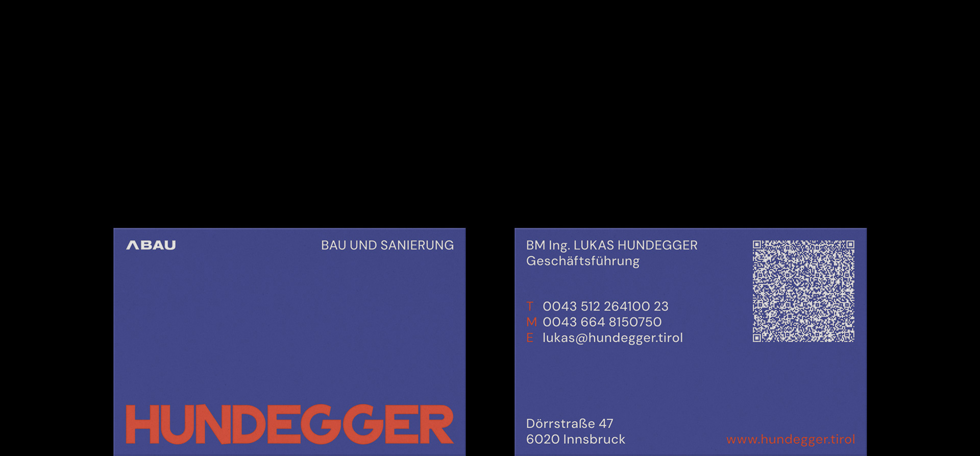
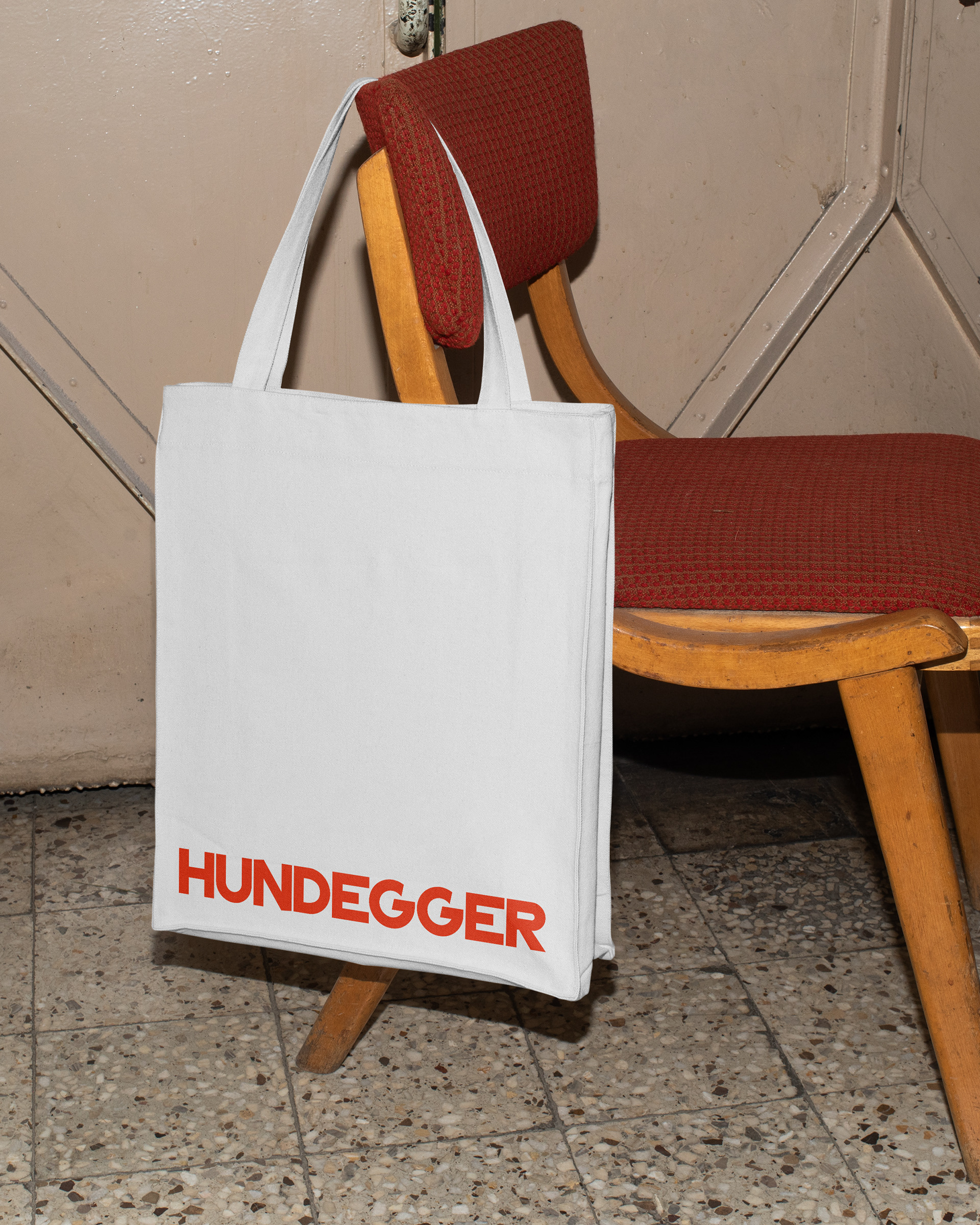
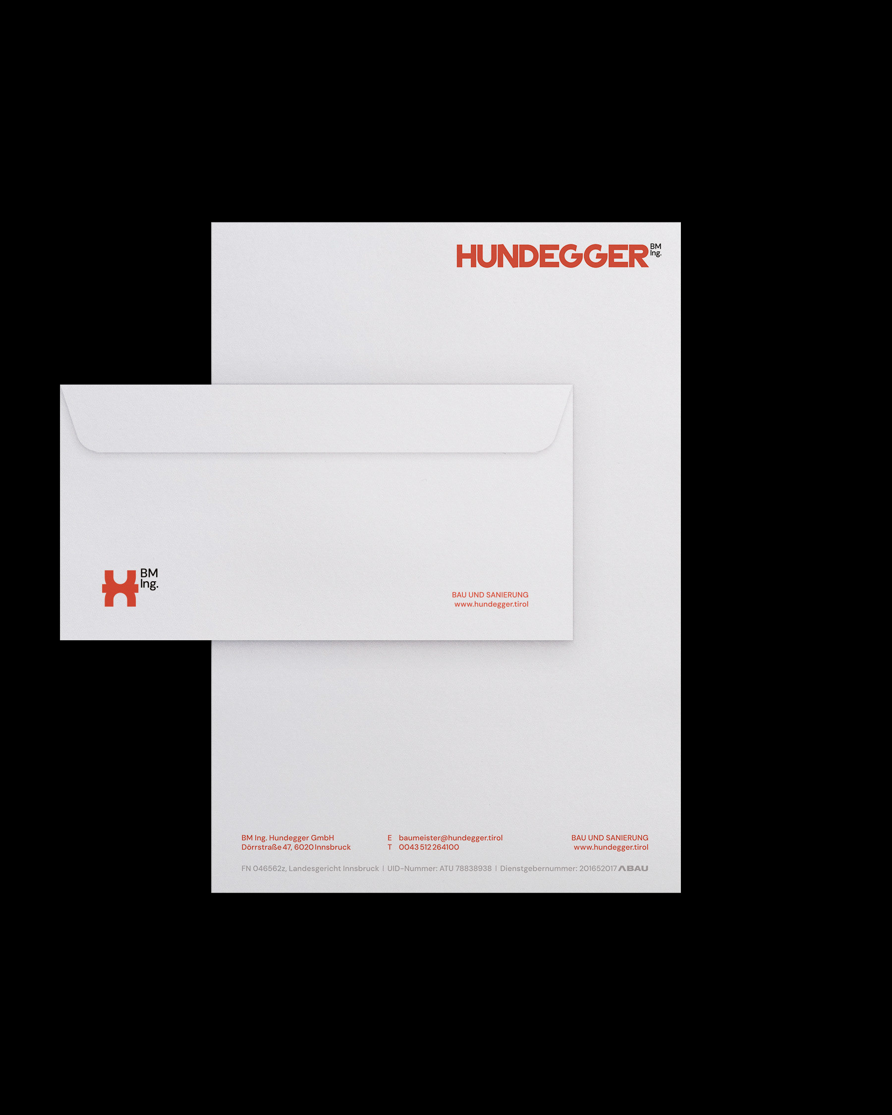
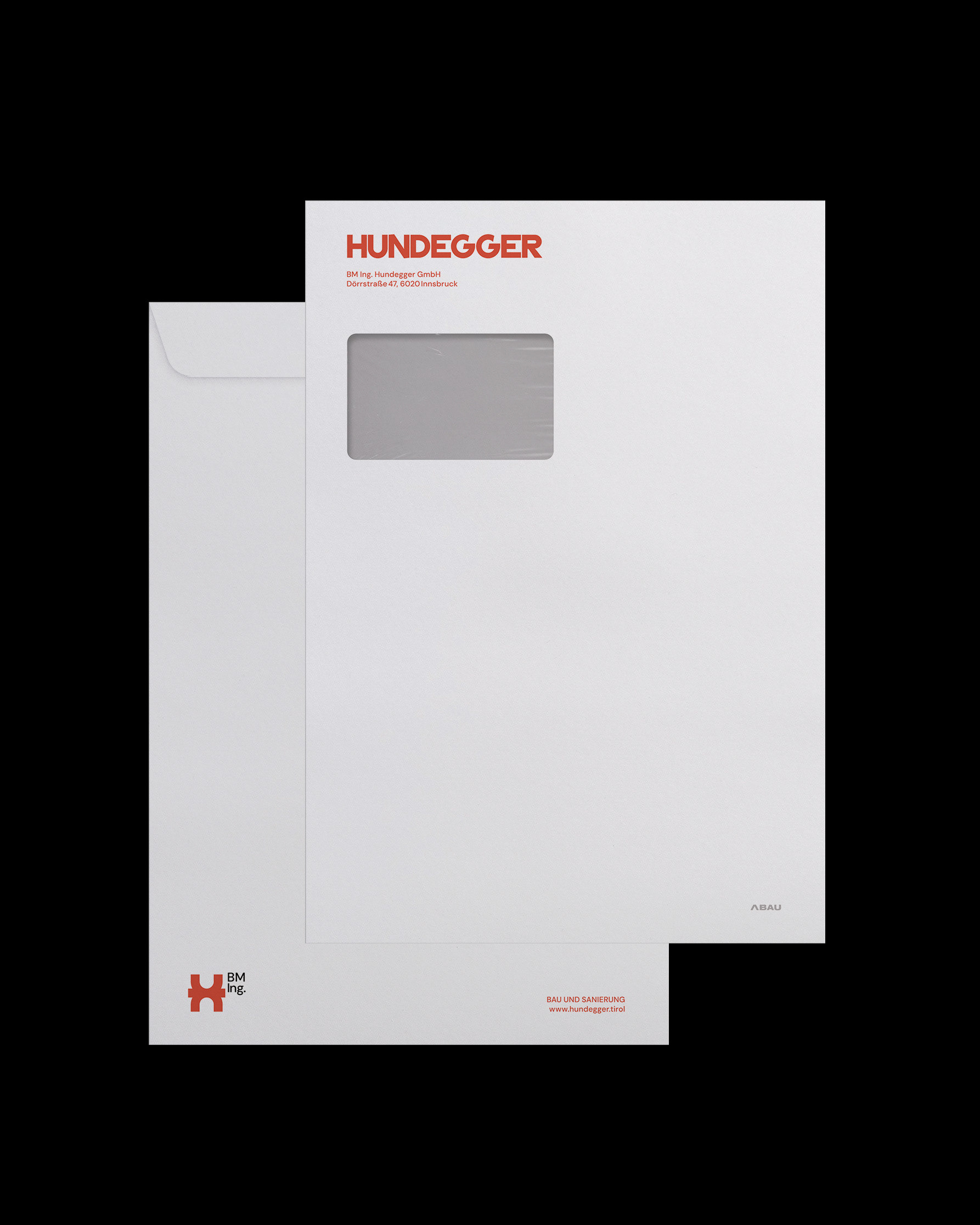
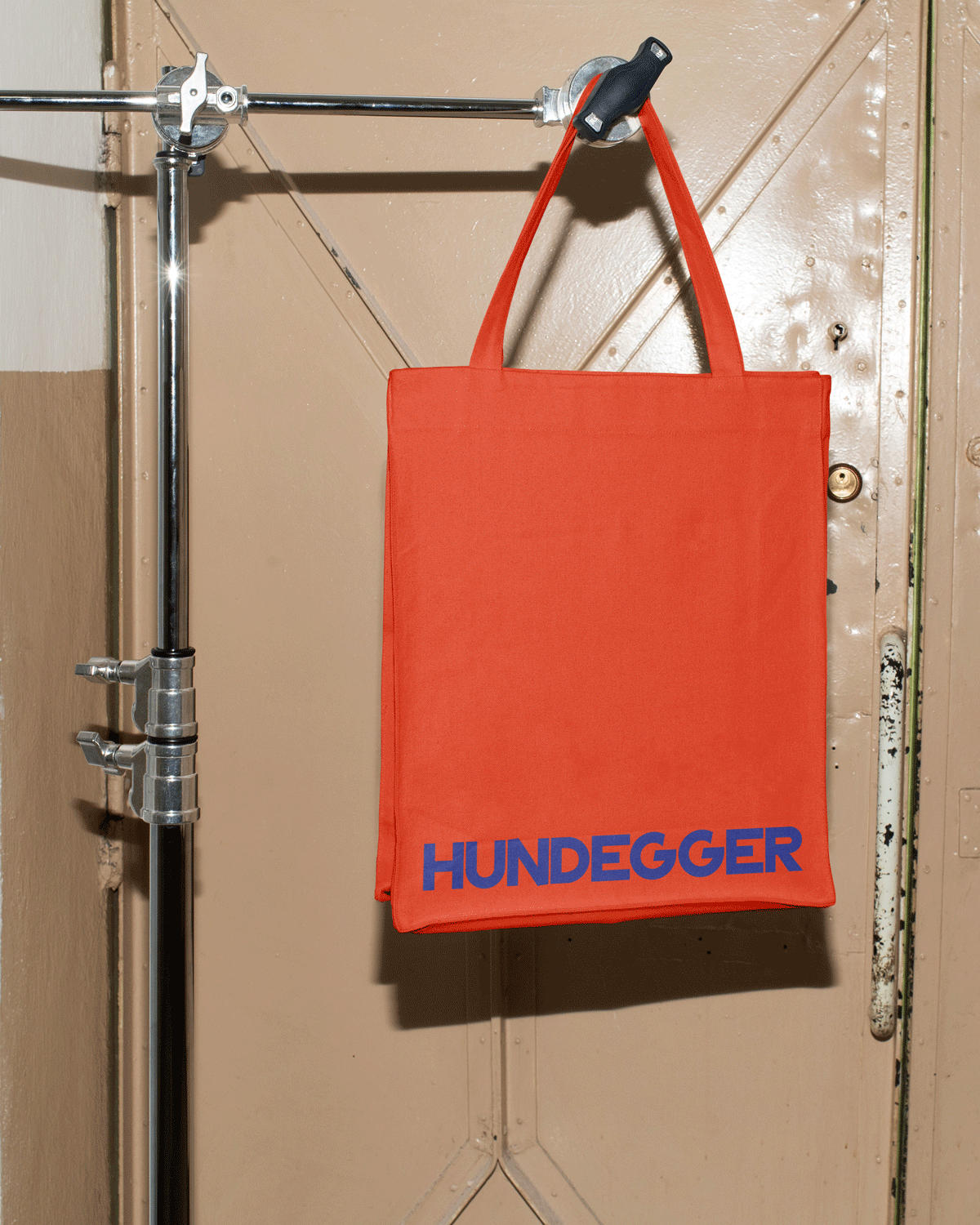
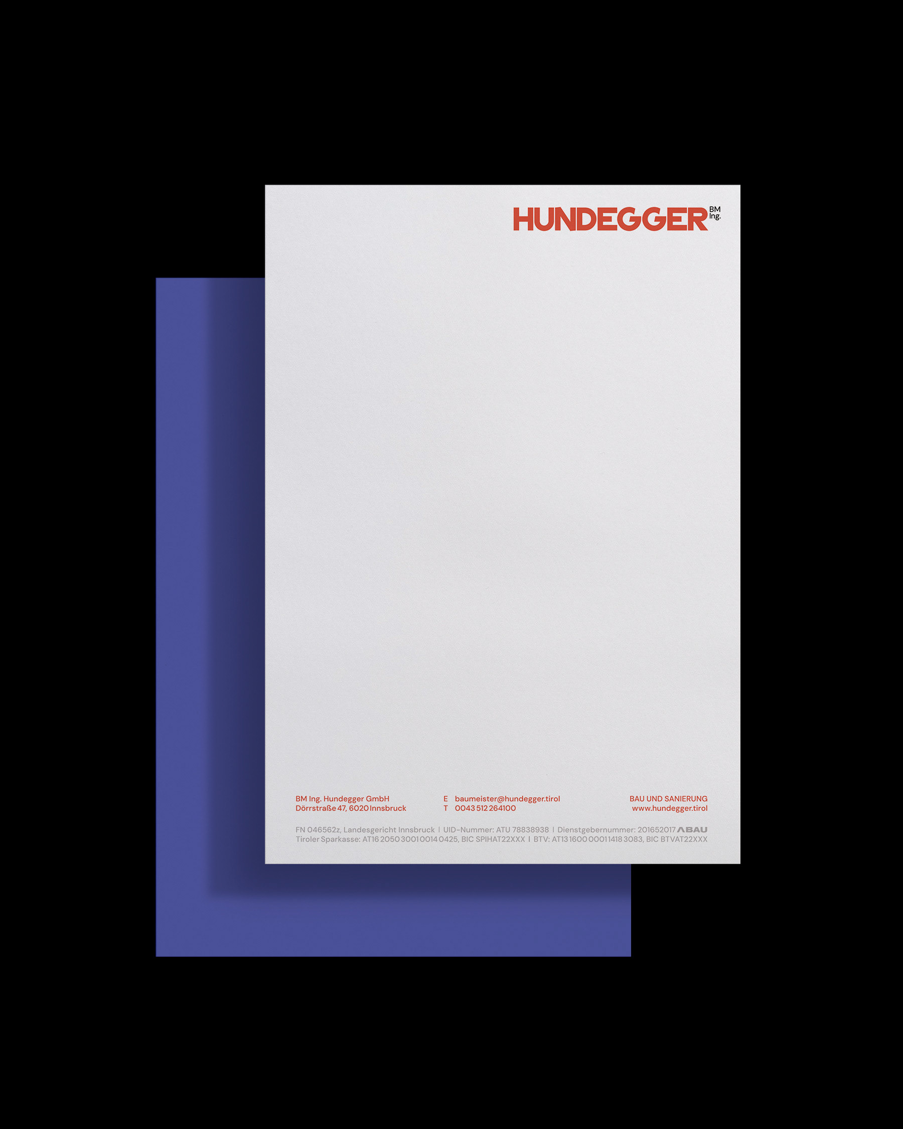
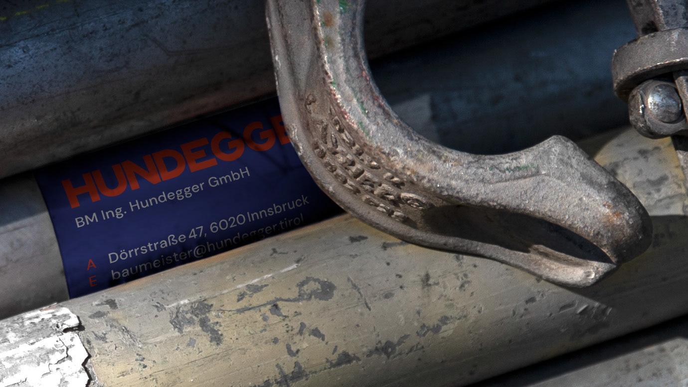
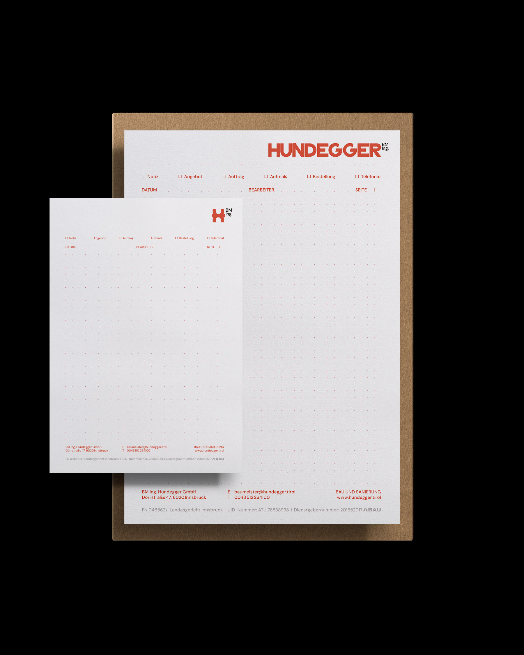
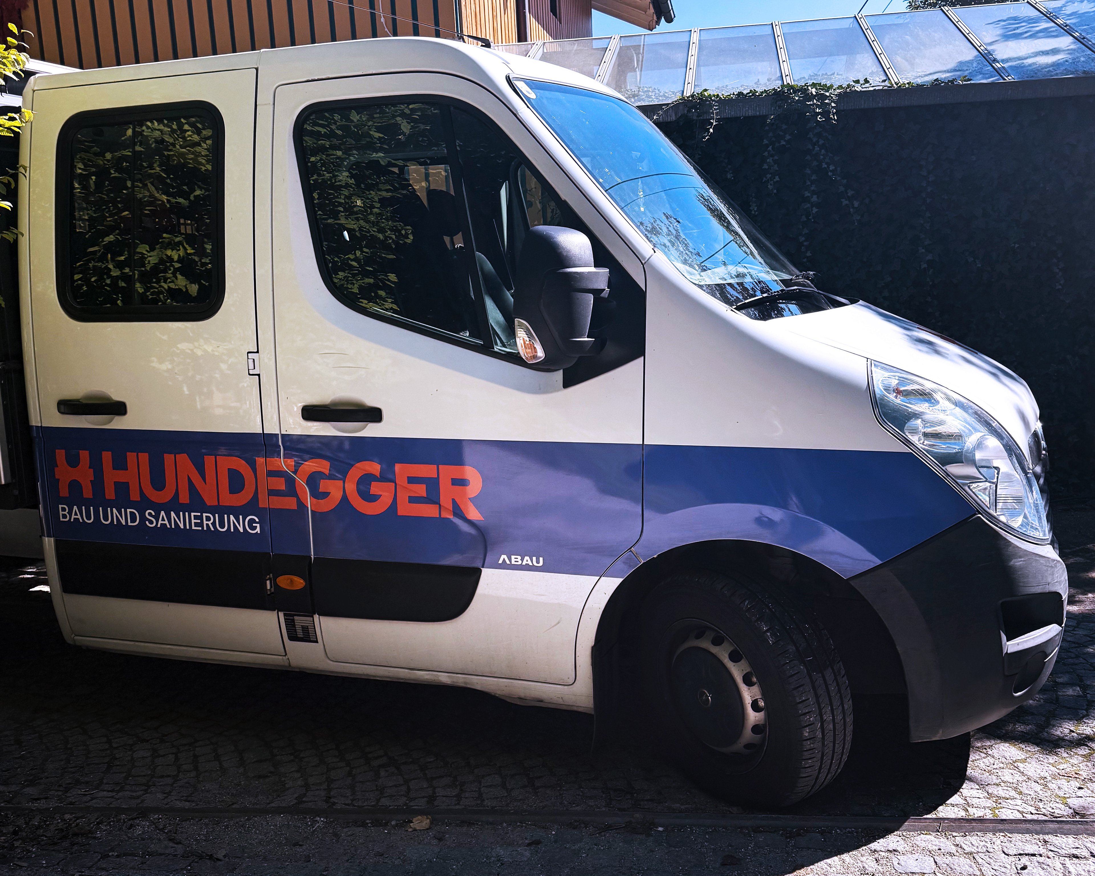
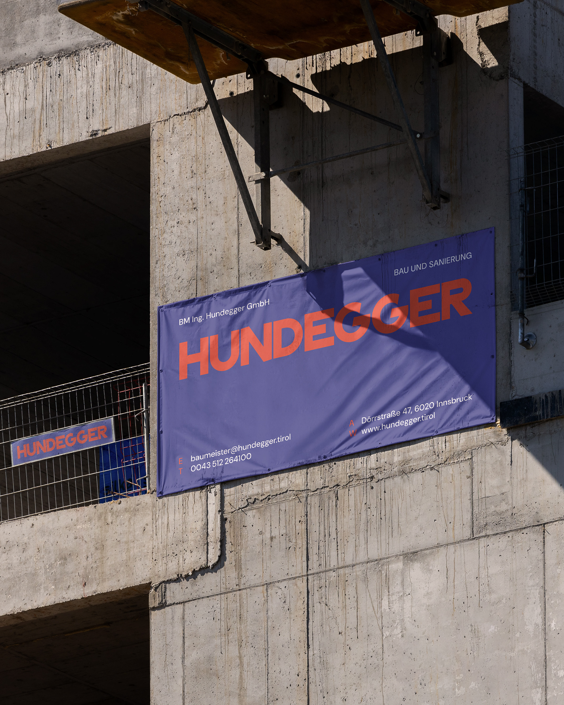
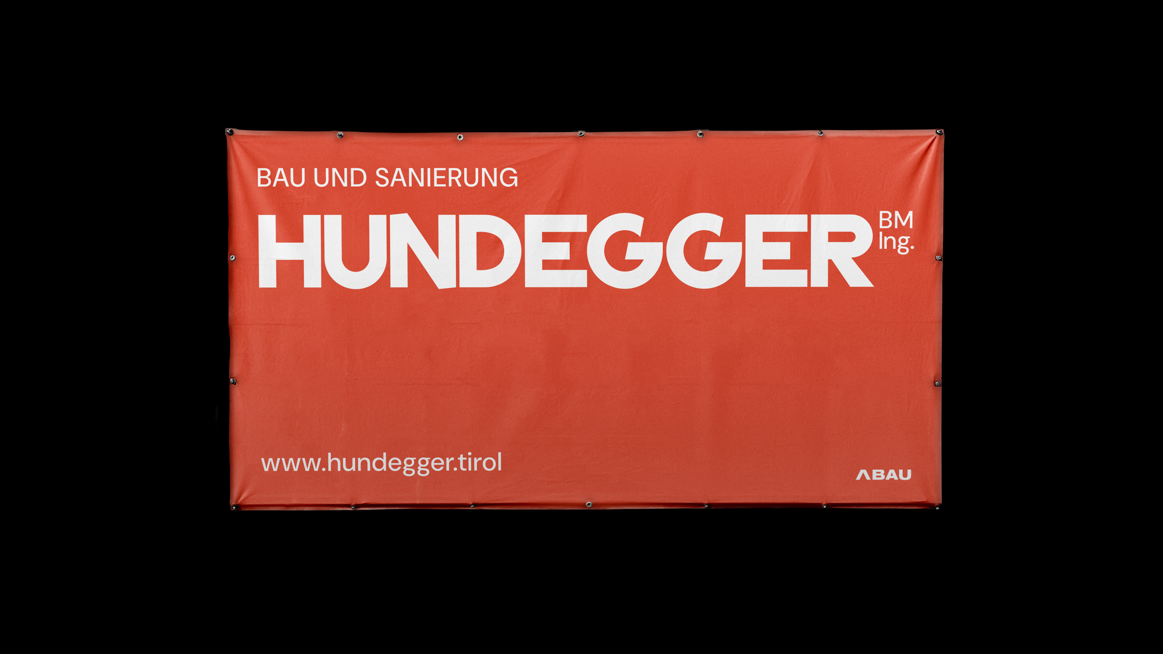
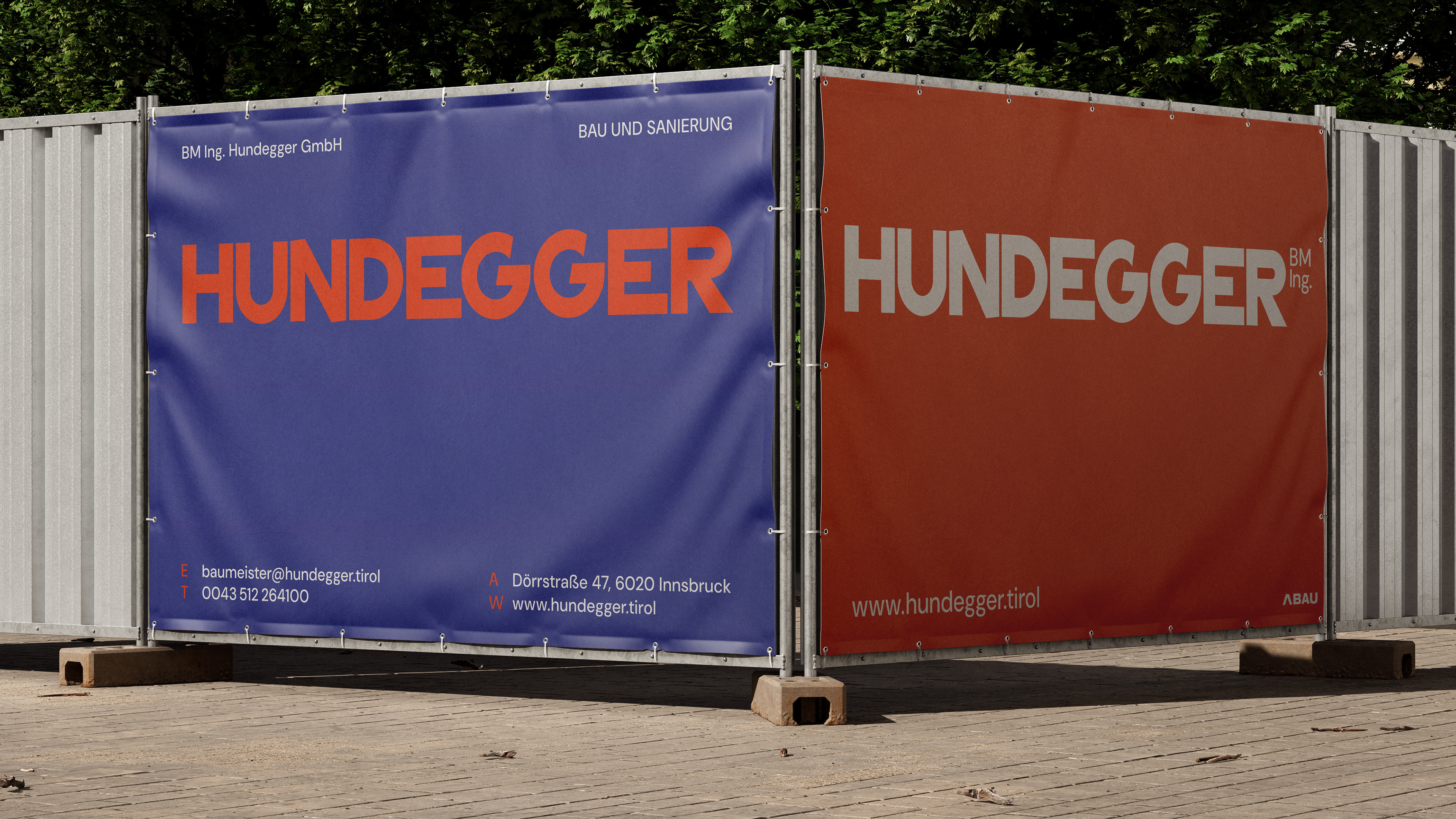
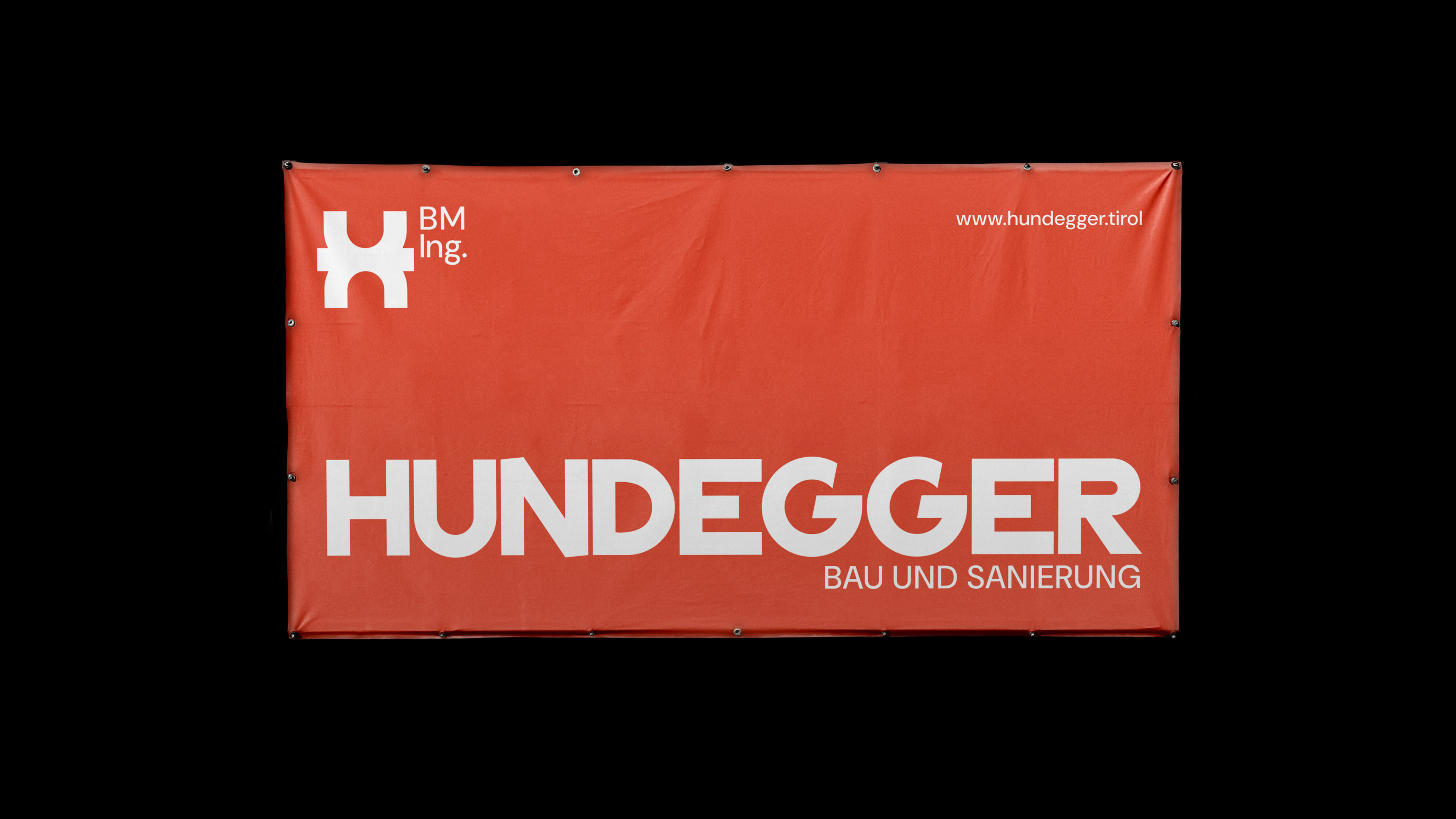
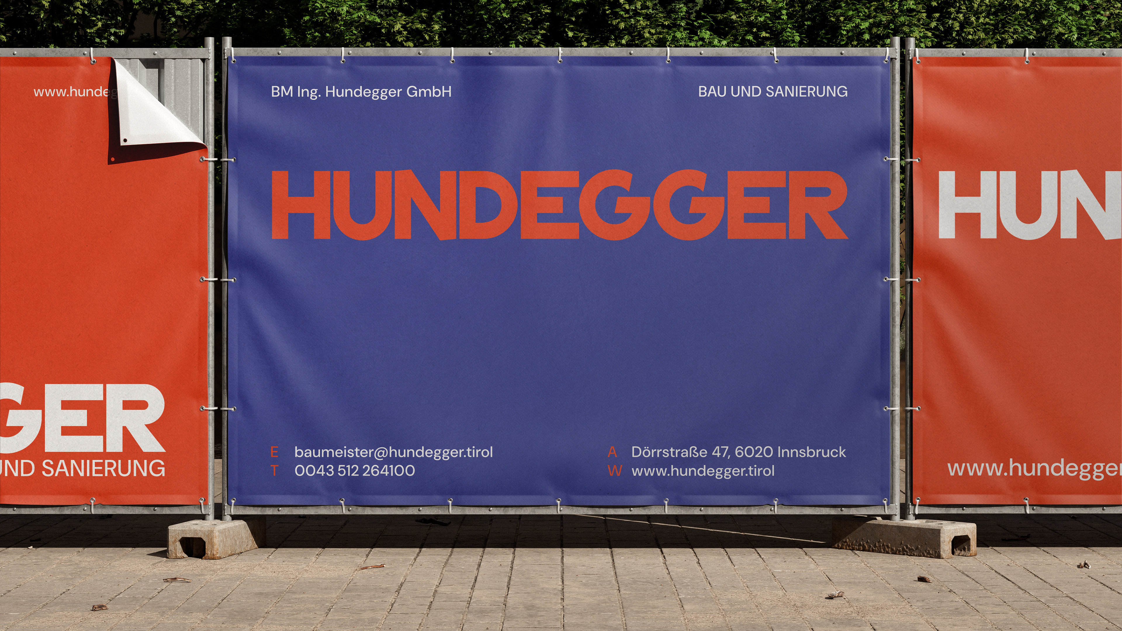
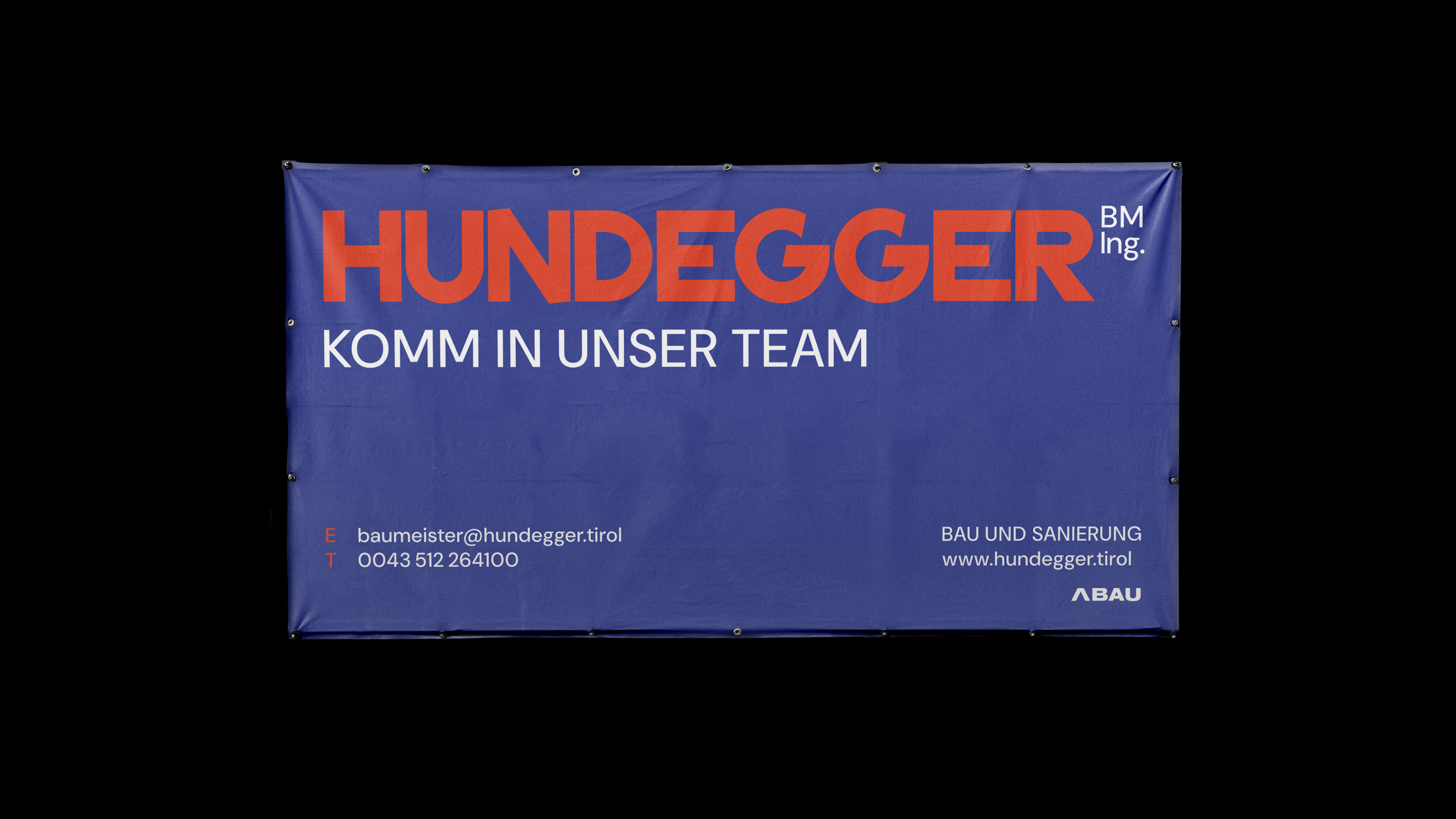
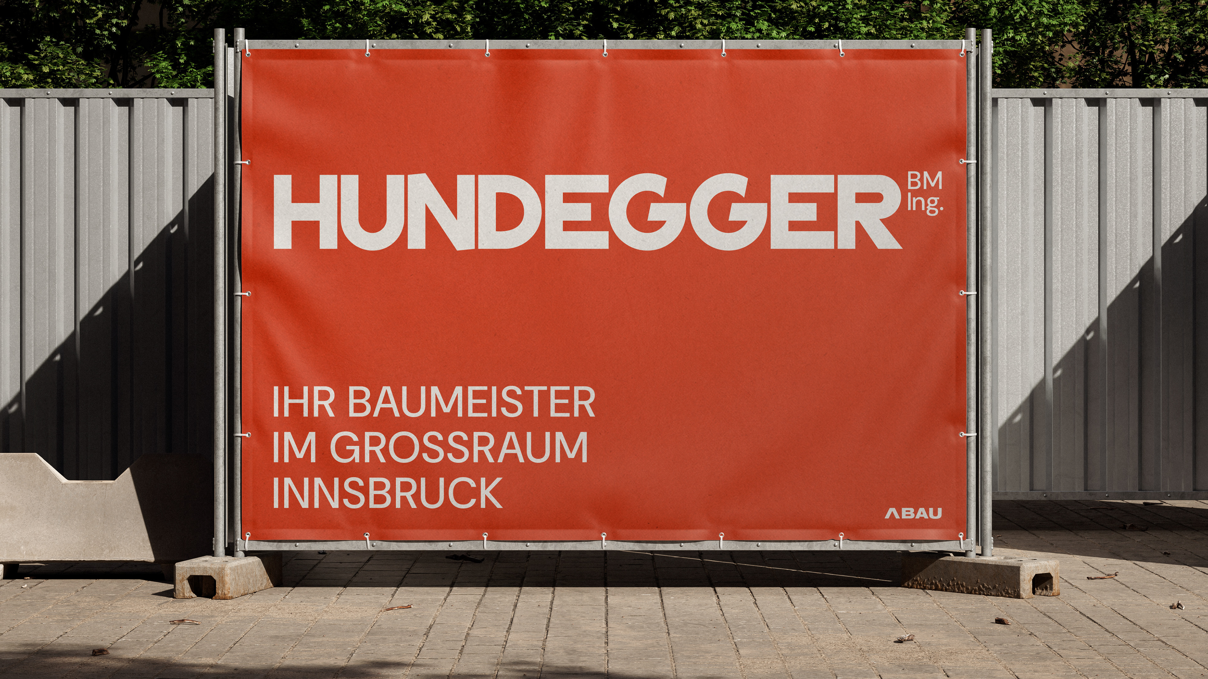
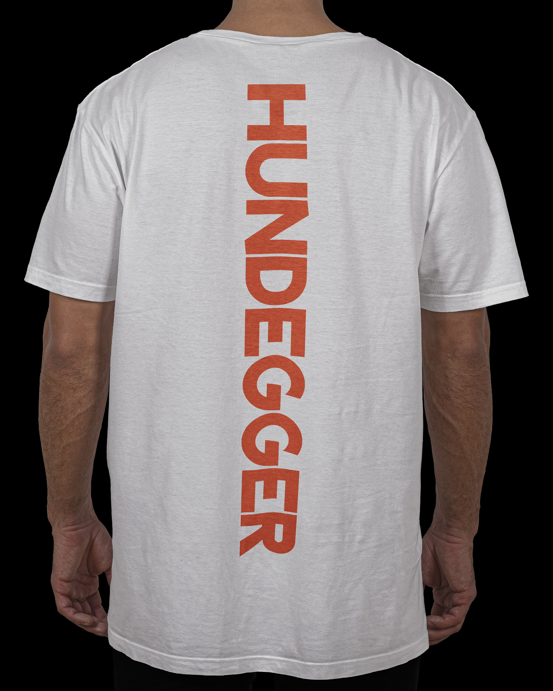
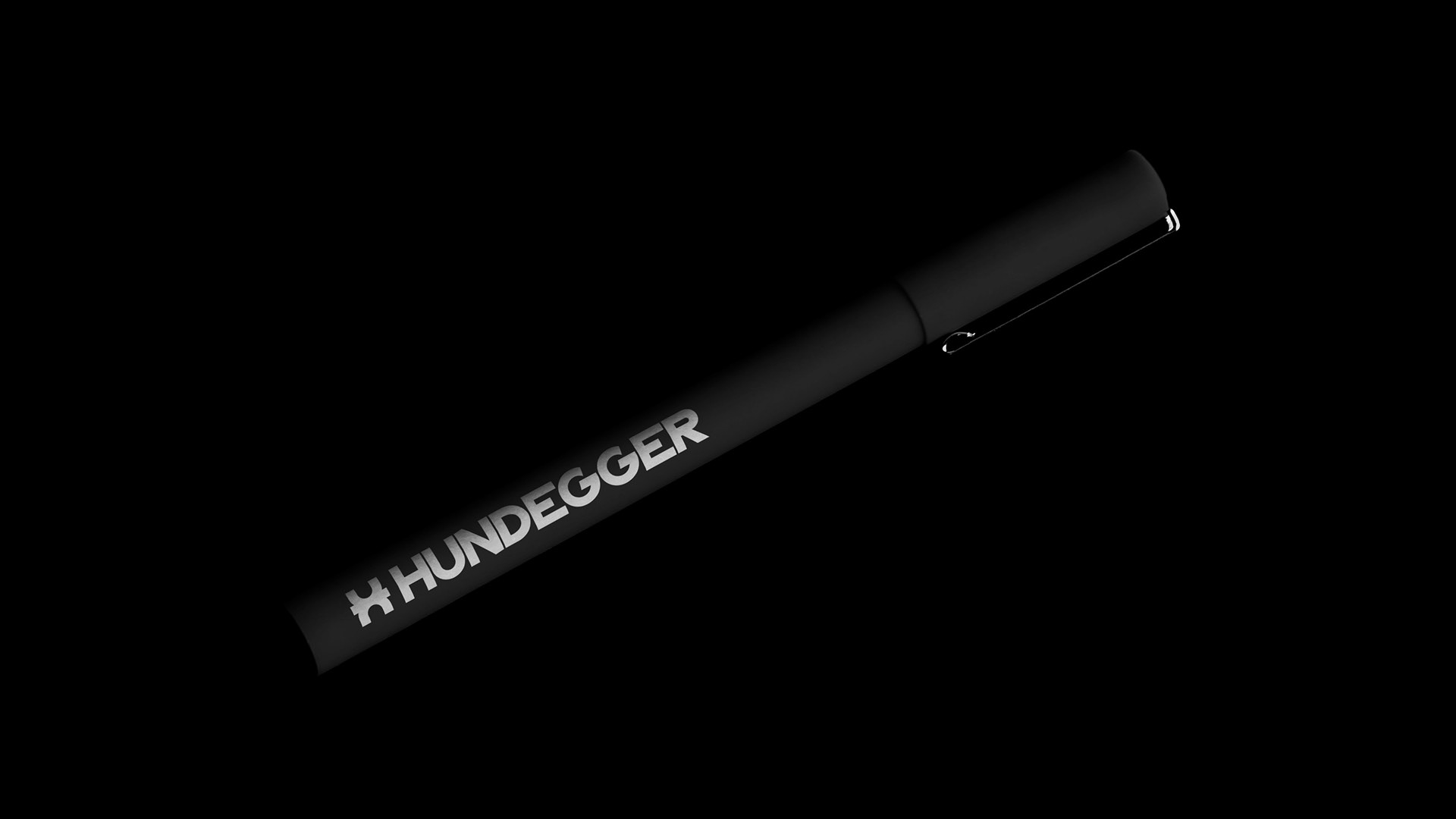
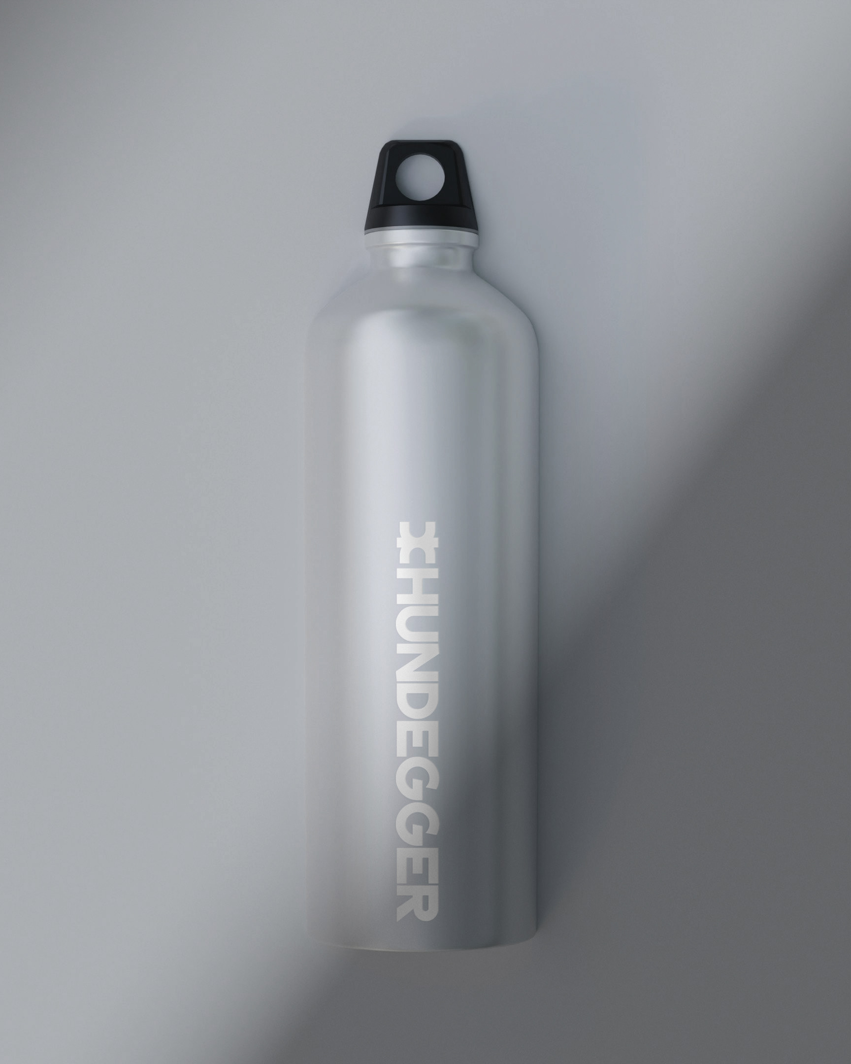
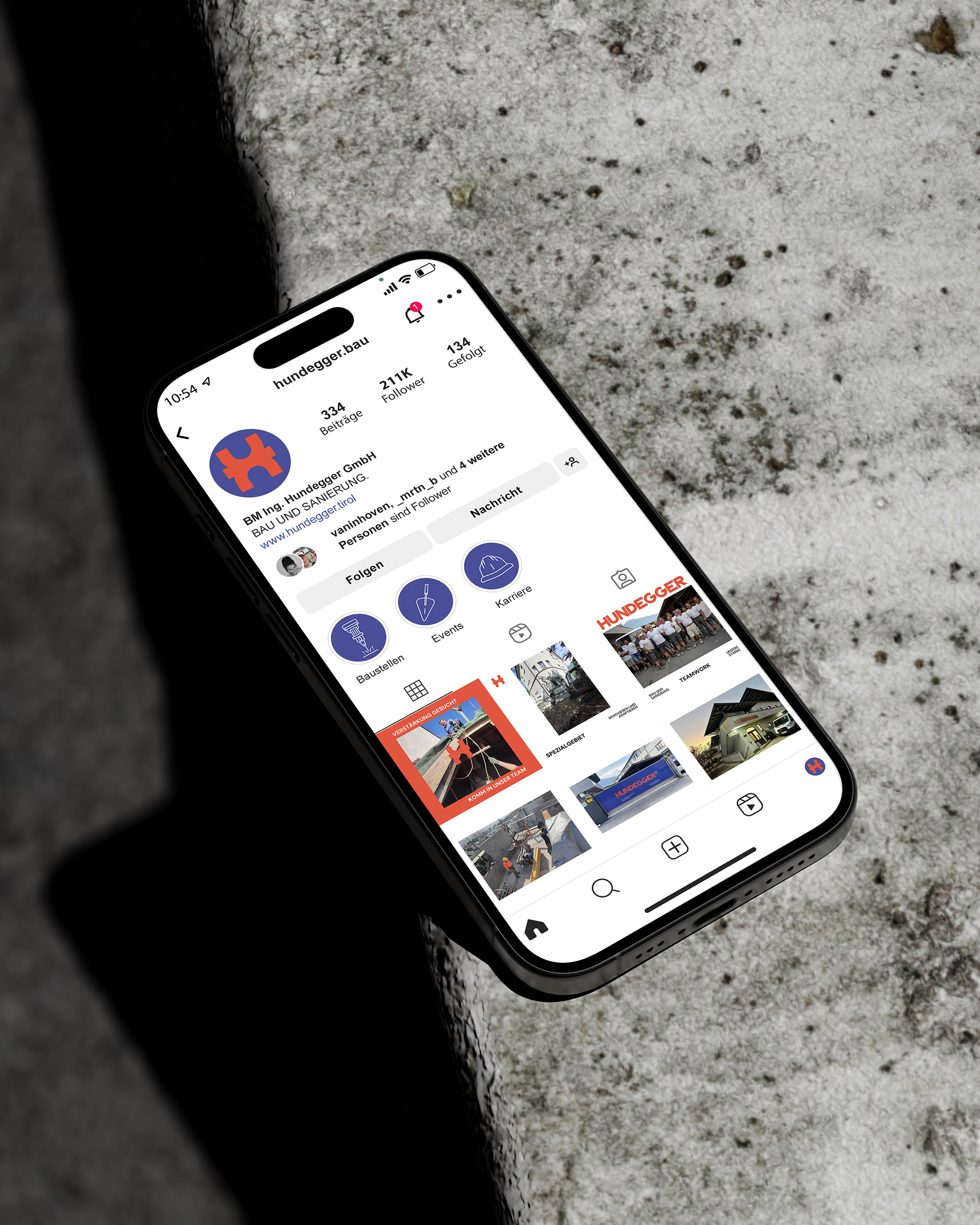
The new visual language revolves around contrasting colours, stark structures and adaptable forms. A refined colour palette, mainly characterised by the interplay of vermilion orange and royal blue, reflect the company's core values, while the strategic use of negative space adds depth. These primary tones are complemented by a deep black and pure white.
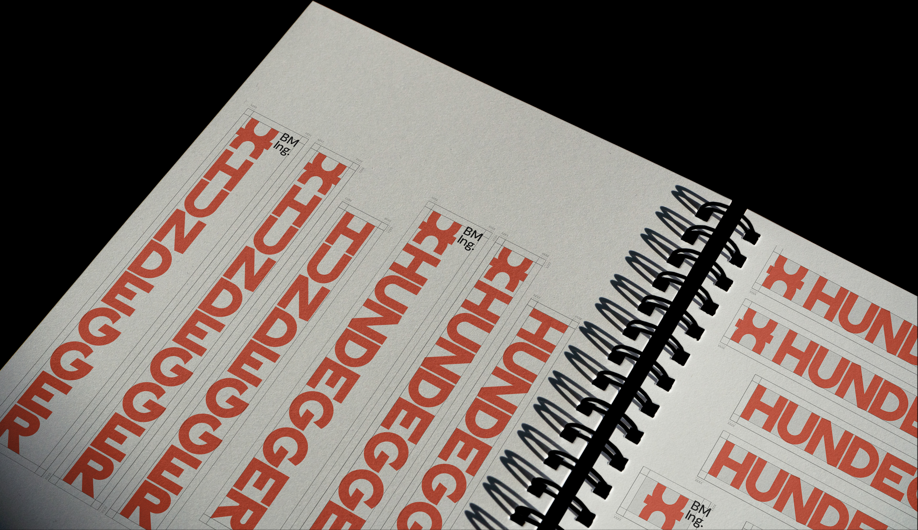
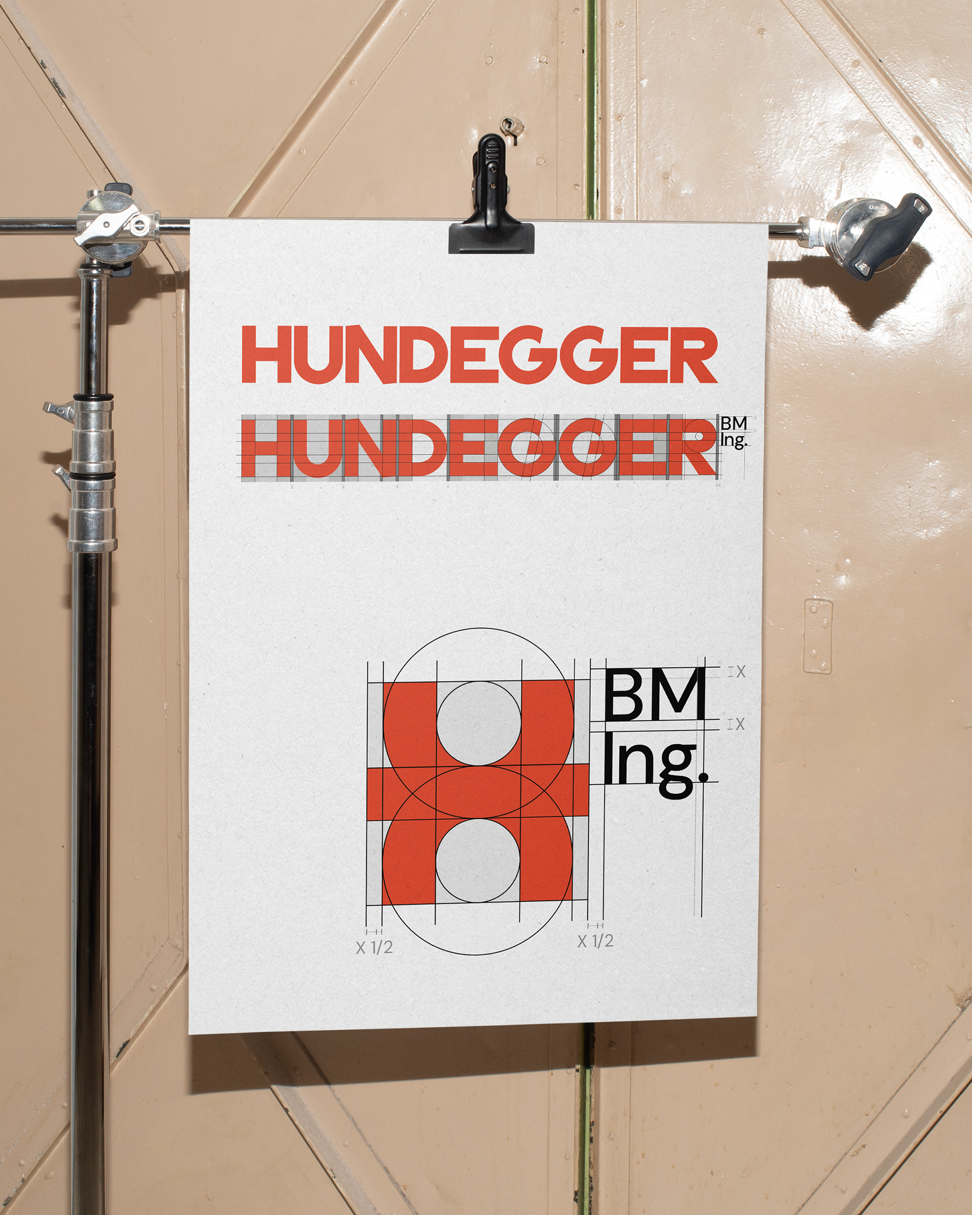
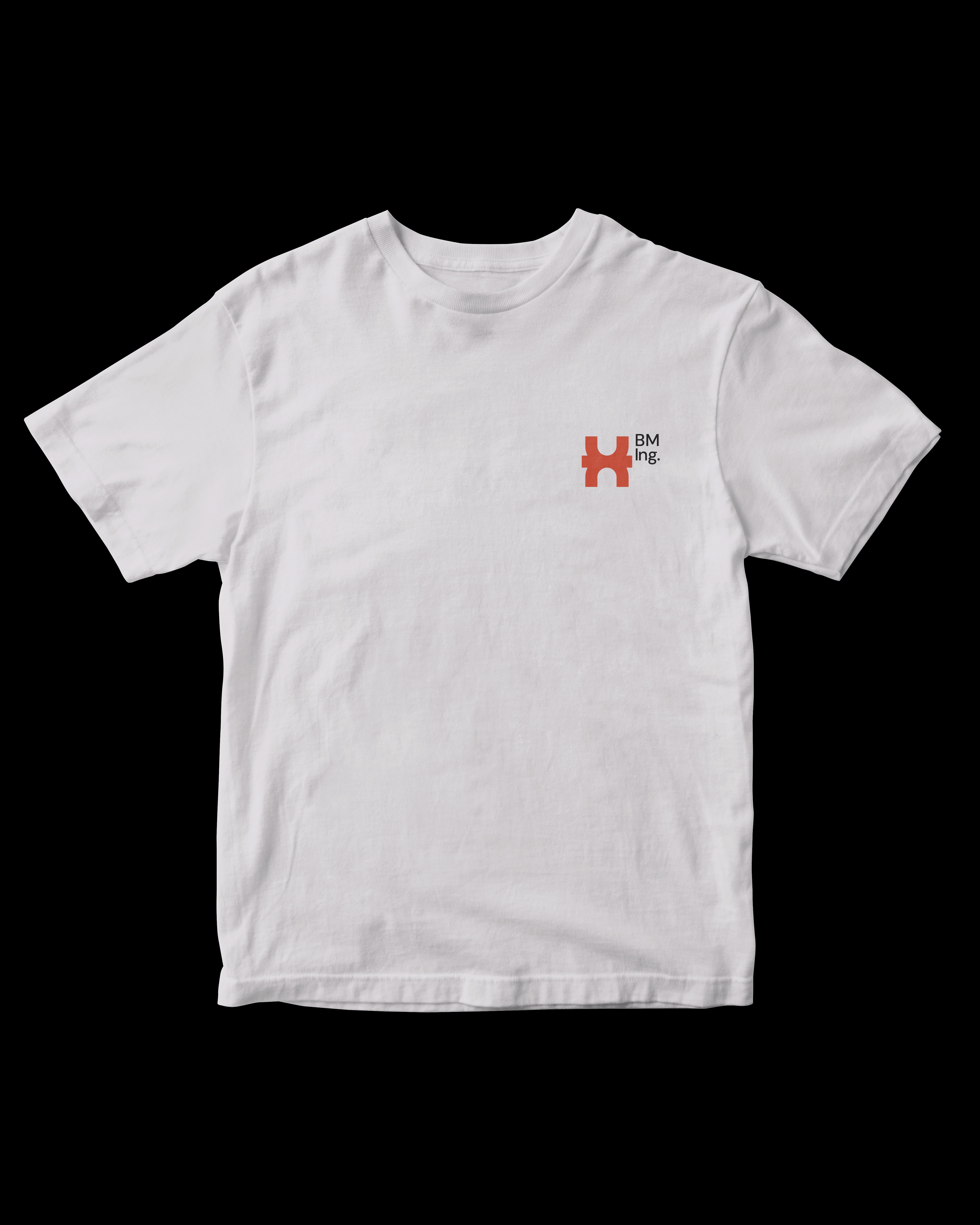
The custom wordmark and icon are rooted in geometric simplicity and proportions following the Golden Ratio. They playfully adapt in size, complexity and colour to ideally suit their environment, context and medium. Forms are carefully dismantled and reconstructed to create a confident visual language that represents the company’s ‘can-do’ attitude and its shift towards resource-efficient practices.
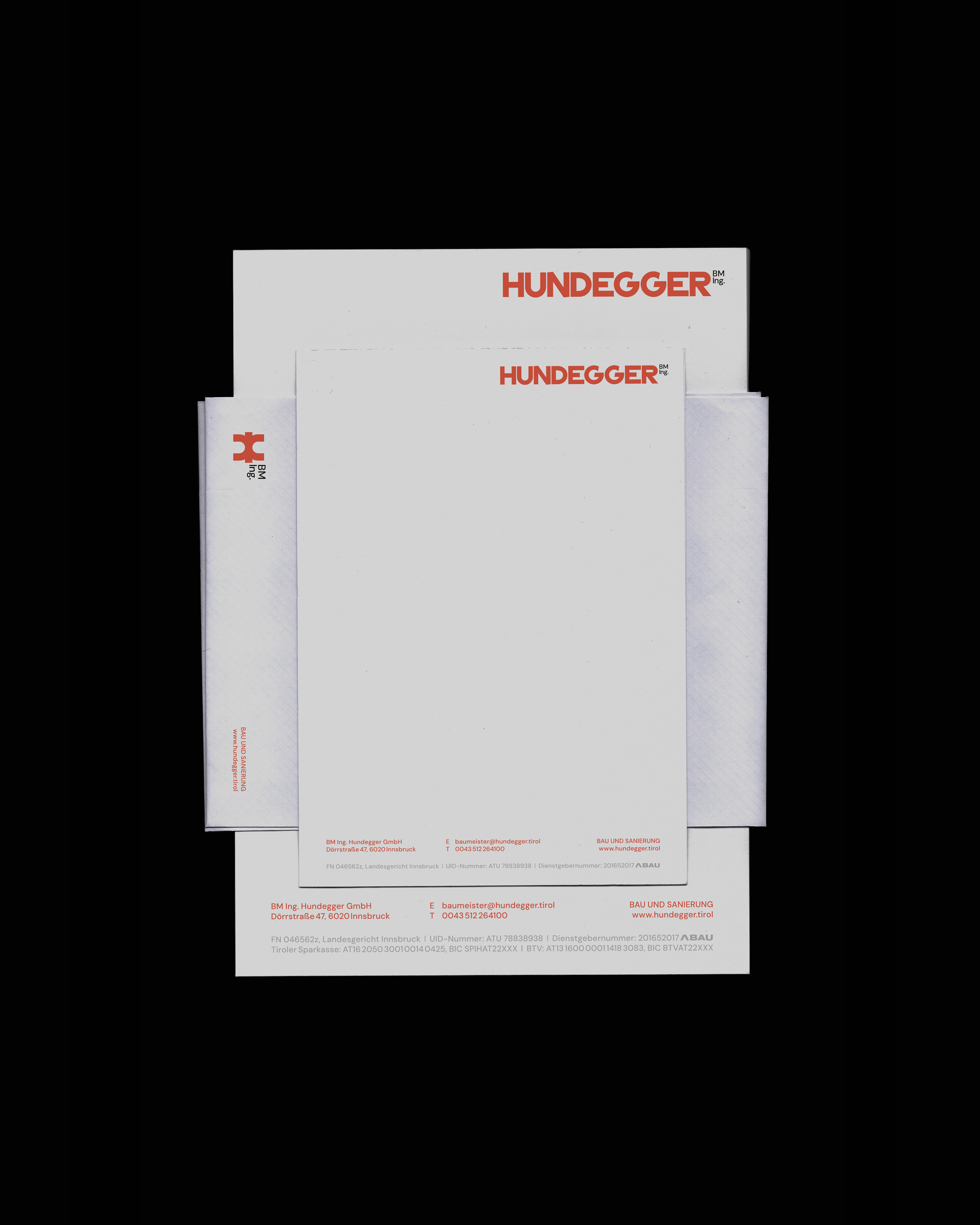
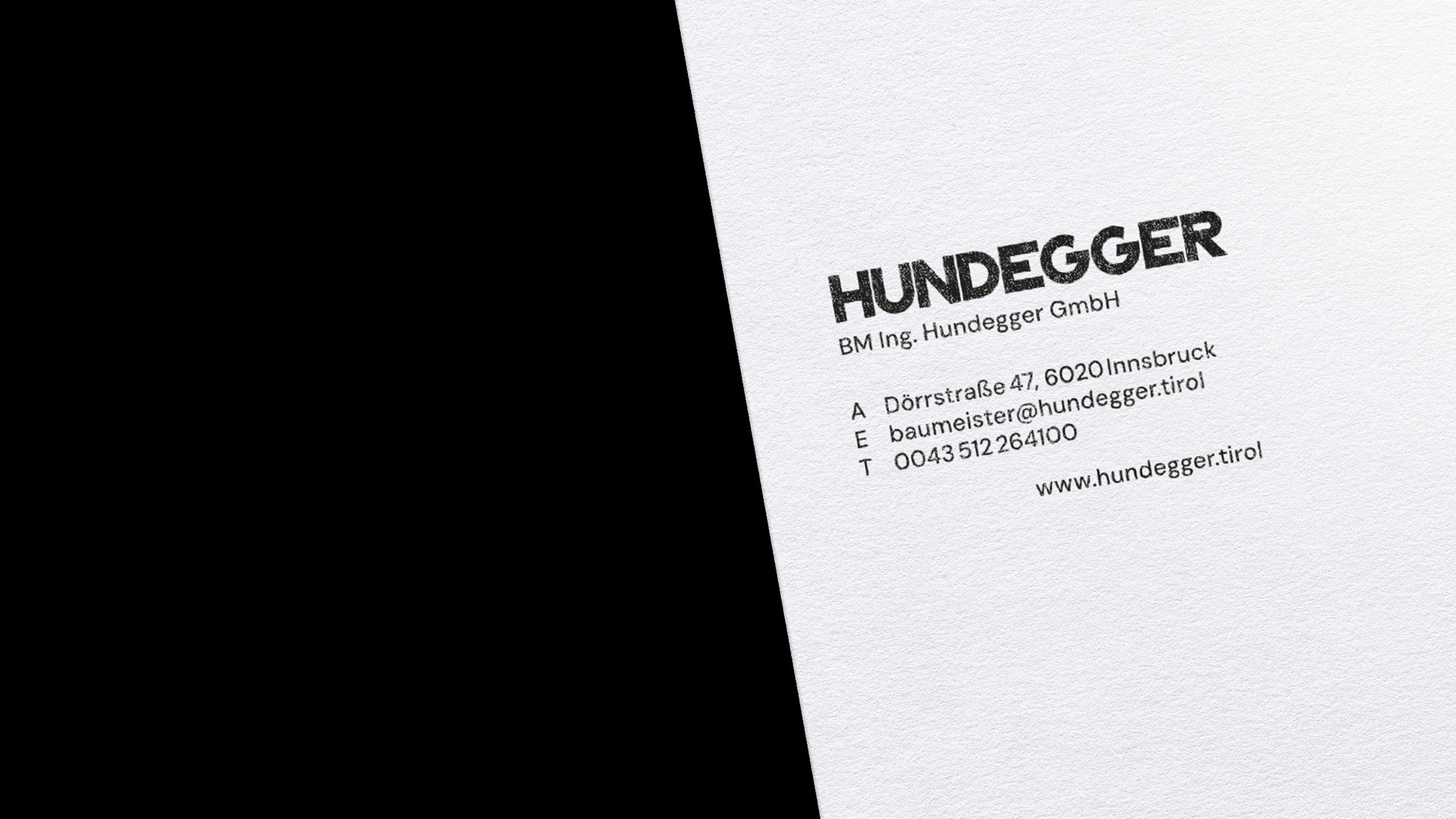
The addition ‘BM Ing.’ [master builder] is set in DM Sans Medium by Colophon Foundry. Set in superscript, it functions as a trademark, a seal of quality that distinguishes the company from its competitors. Reminiscent of the company's original 1980s marks, the new custom cut and the low contrast convey stability and precision, maintaining a sense of familiarity while looking towards the future. The company's initials [H+U] combine to form a square mark — an icon with a clear cut that conveys stability and timeless practicality.