Swatch Nines Event identity concepts
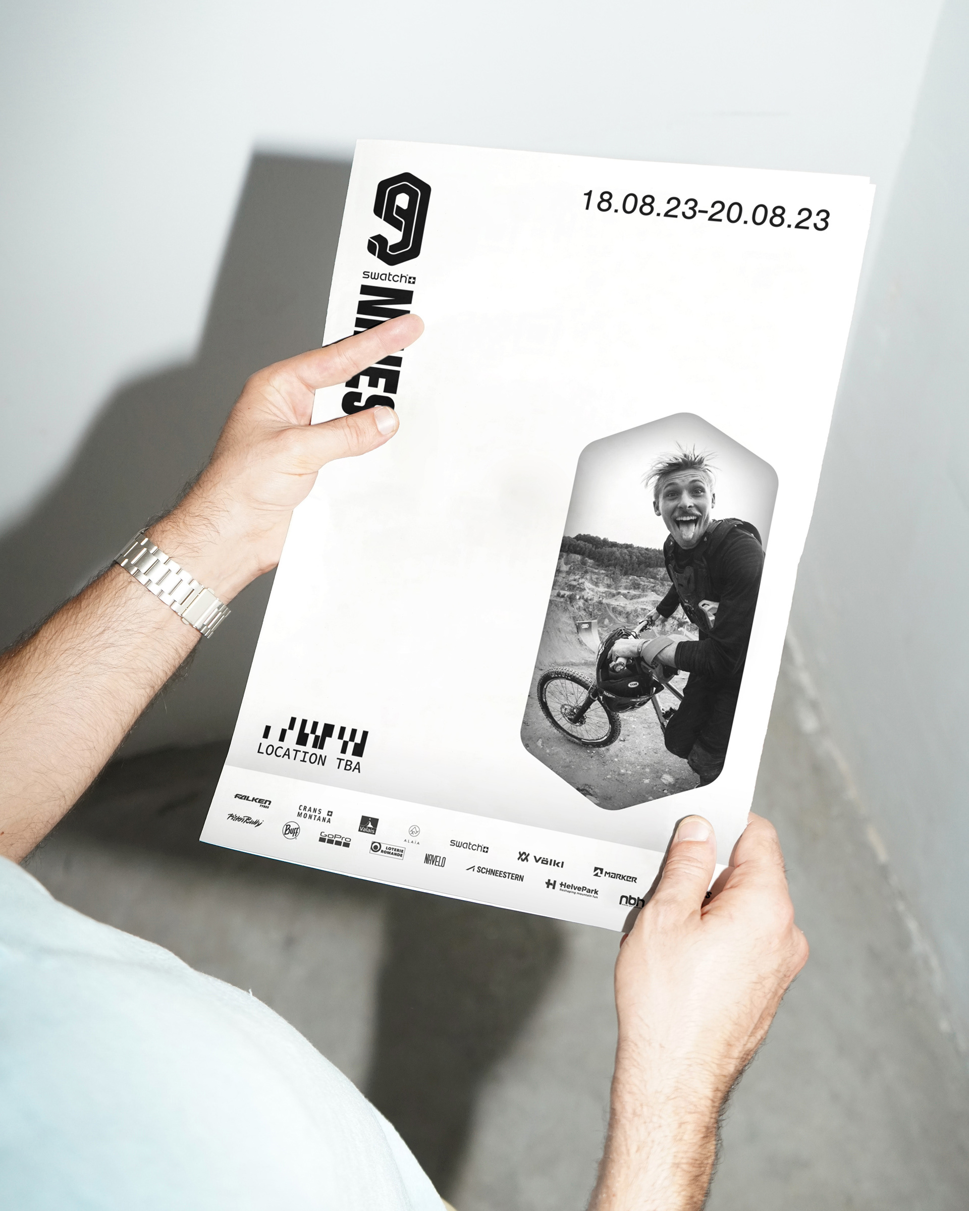
Throughout its 15-year history, the event series known over the years as The Nine Knights, Queens, Royals, The [Audi] Nines and lastly [Swatch] Nines has undergone many transformations — from a small regional happening for freestyle skiers to an internationally recognised, multi-disciplinary action sports series. In winter, epic snow park setups in extraordinary locations are amped up by star-studded lineups of skiers and snowboarders. In summer, professional world-class freeride mountain bikers push their limits on unparalleled features in adrenaline-fuelled settings.
Bolstered by a new title sponsor, a new name and location, the Nines team sought fresh perspectives and new directions, looking to continue pushing to new levels of creativity, progression and excitement. The brief was to find a new identity inspired by Retro Futurism with a contemporary feel — an identity that draws inspiration from the past and the event's origins in order to move forward.
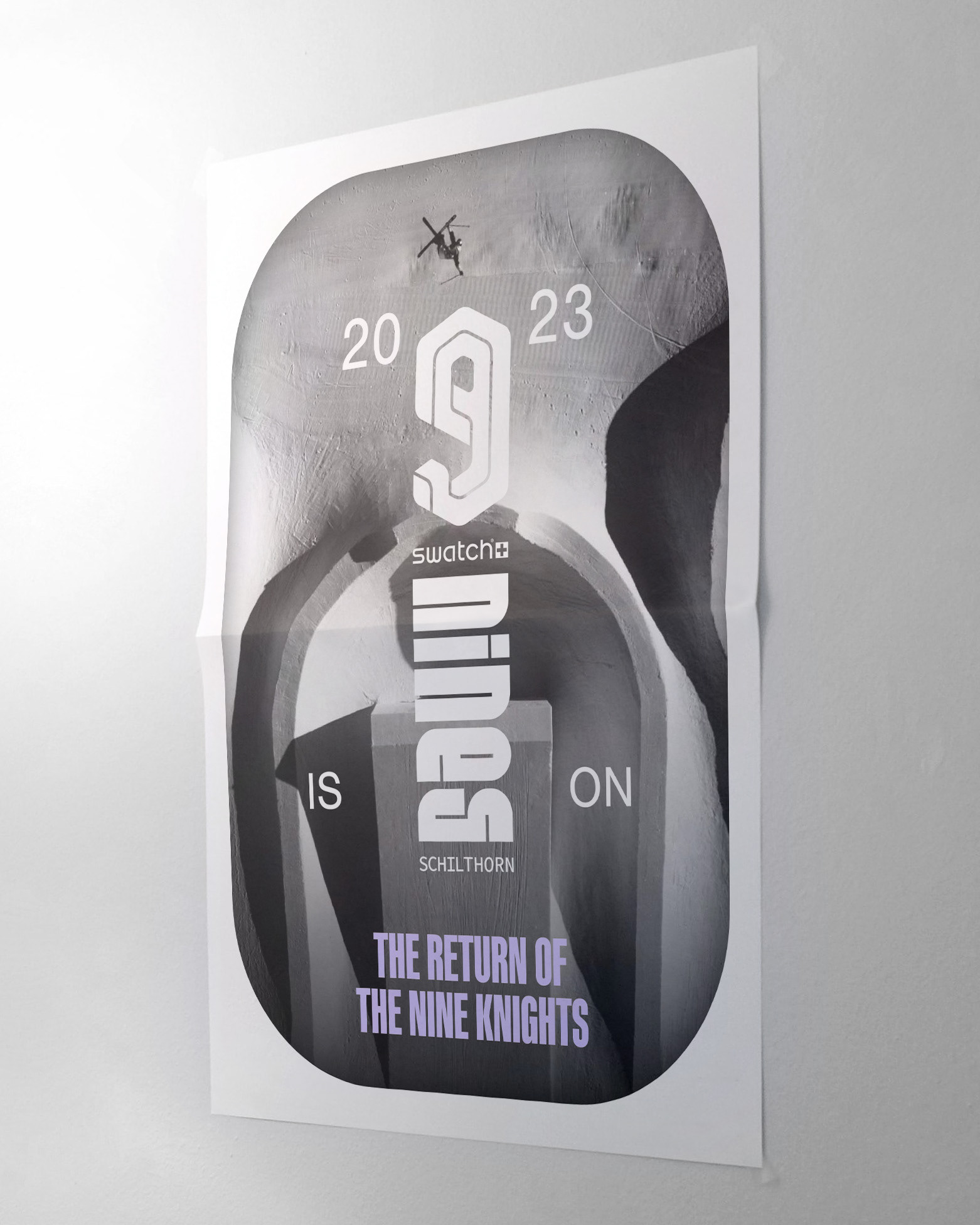
The aim was to close the visual gap between setup design, identity design and retro-futuristic worlds featuring faded colours, bizarre and utopian themes. Central to this was the creation of organic spaces, immersive frames / windows [into the Nines universe] and geometrical shapes. This aligns with their iconic setup design, which has moved away from hard angles towards more flowy, organic features, inspired by architects like Zaha Hadid and Steven Holl.
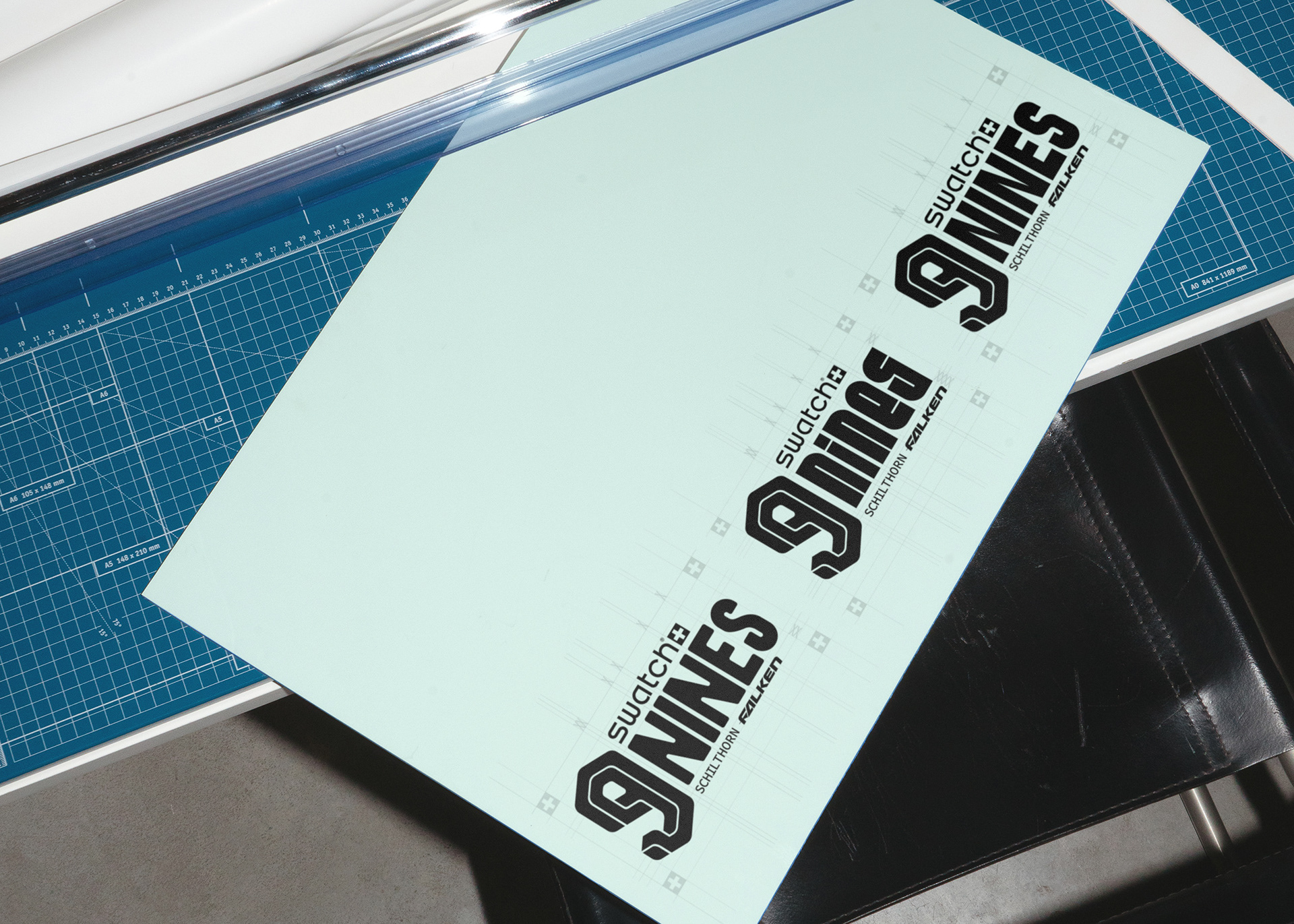
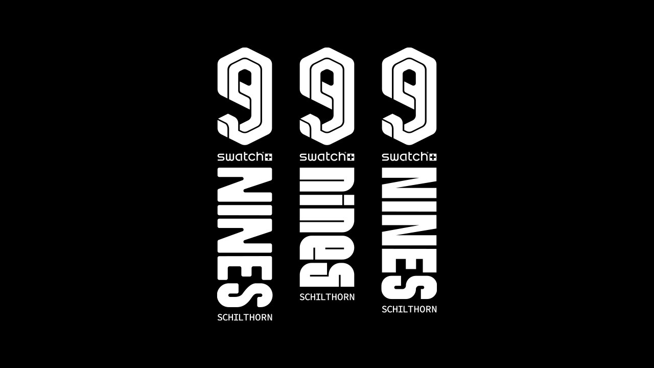
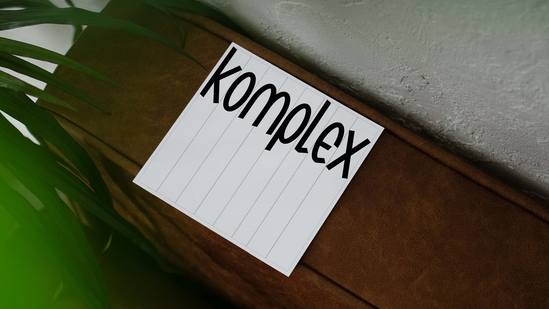
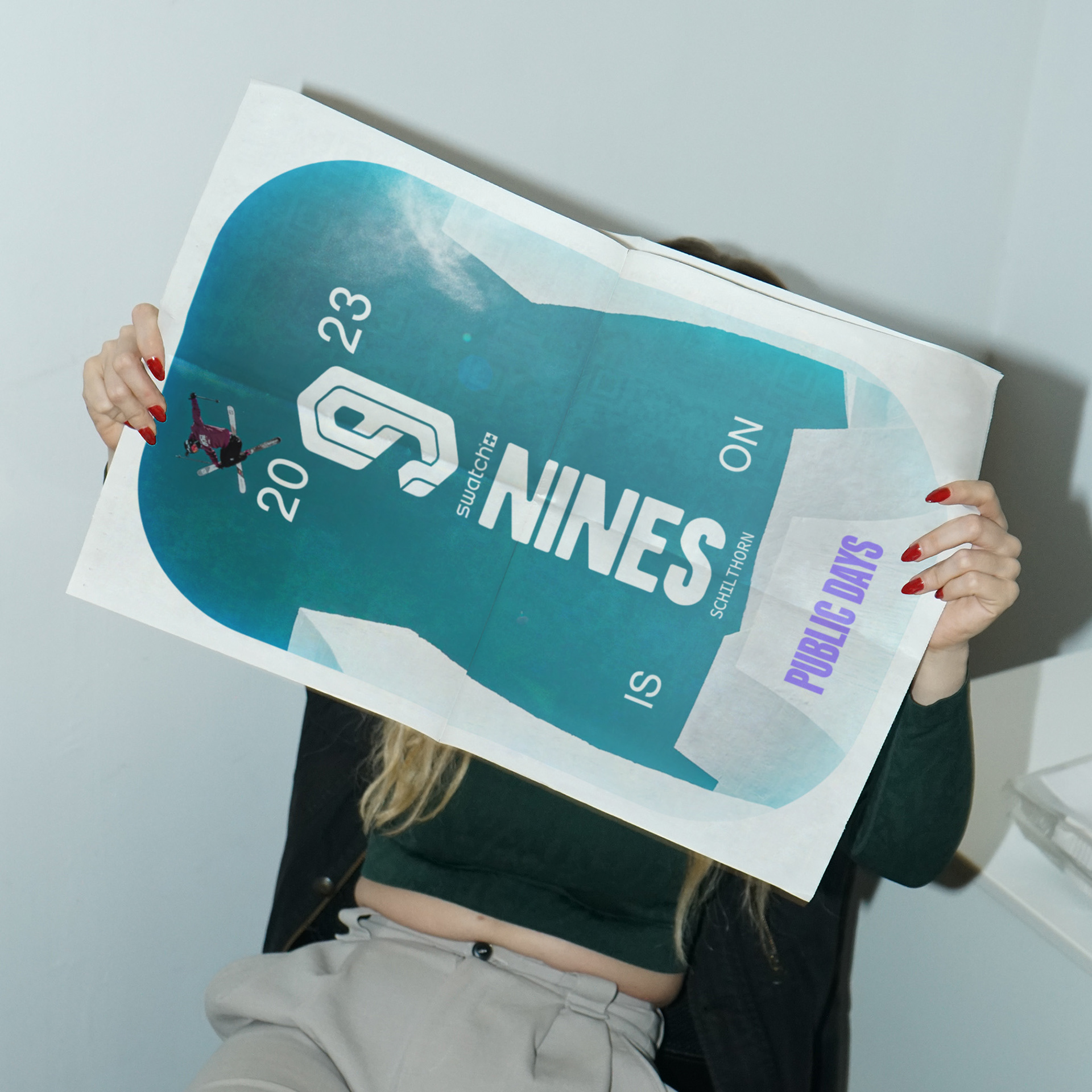
The vertical logotype versions allude the shape of a wristwatch, a subtle nod to the title sponsor, Swatch.
For the [changing] event locations Adobe Originals Source Code Medium is suggested. The pairing of Max Miedinger’s Nimbus Sans for body text with Ryoichi Tsunekawa’s Kaneda Gothic for headlines balances the nostalgic, retro-futuristic aesthetic and the contemporary demands of the Nines. The narrow nature of Kaneda Gothic, alluding to the futuristic 1980s and 1990s imagery of giant metropolises, perfectly complements the condensed forms of the various logotype concepts.
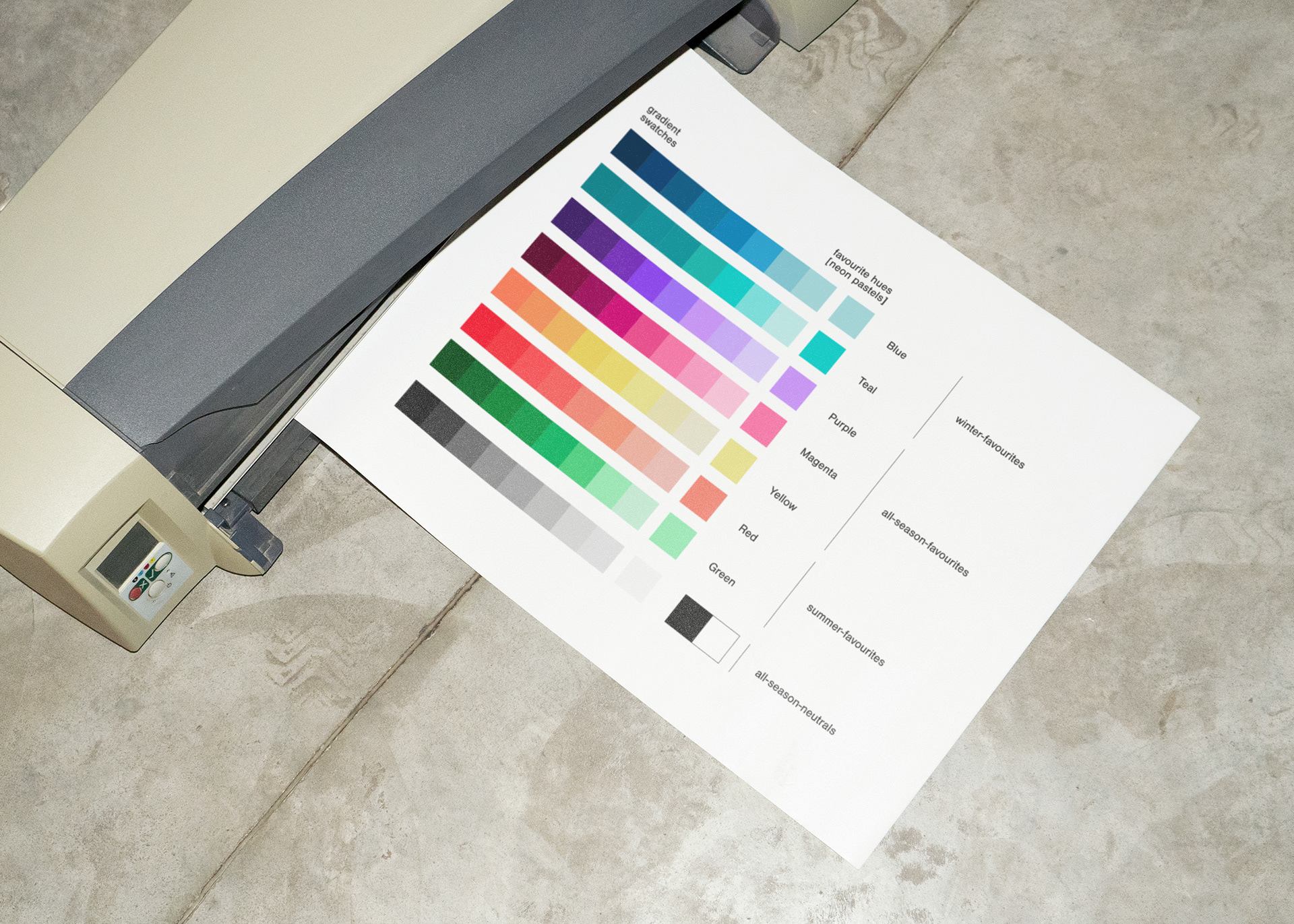
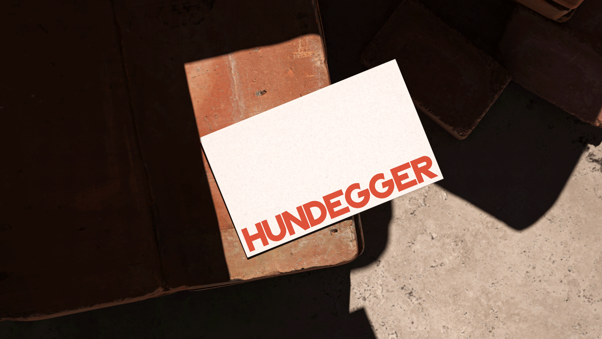
The colour palette similarly draws inspiration from both retro-futurism and the iconic 1990s, the golden era of freestyle and the time of the colourful Swatch craze. The faded neon pastel hues exude an old-school vibe while remaining highly flexible: subtle on their own, yet remarkably vibrant when combined. The colours act as a metaphor for the event’s energy and diversity.
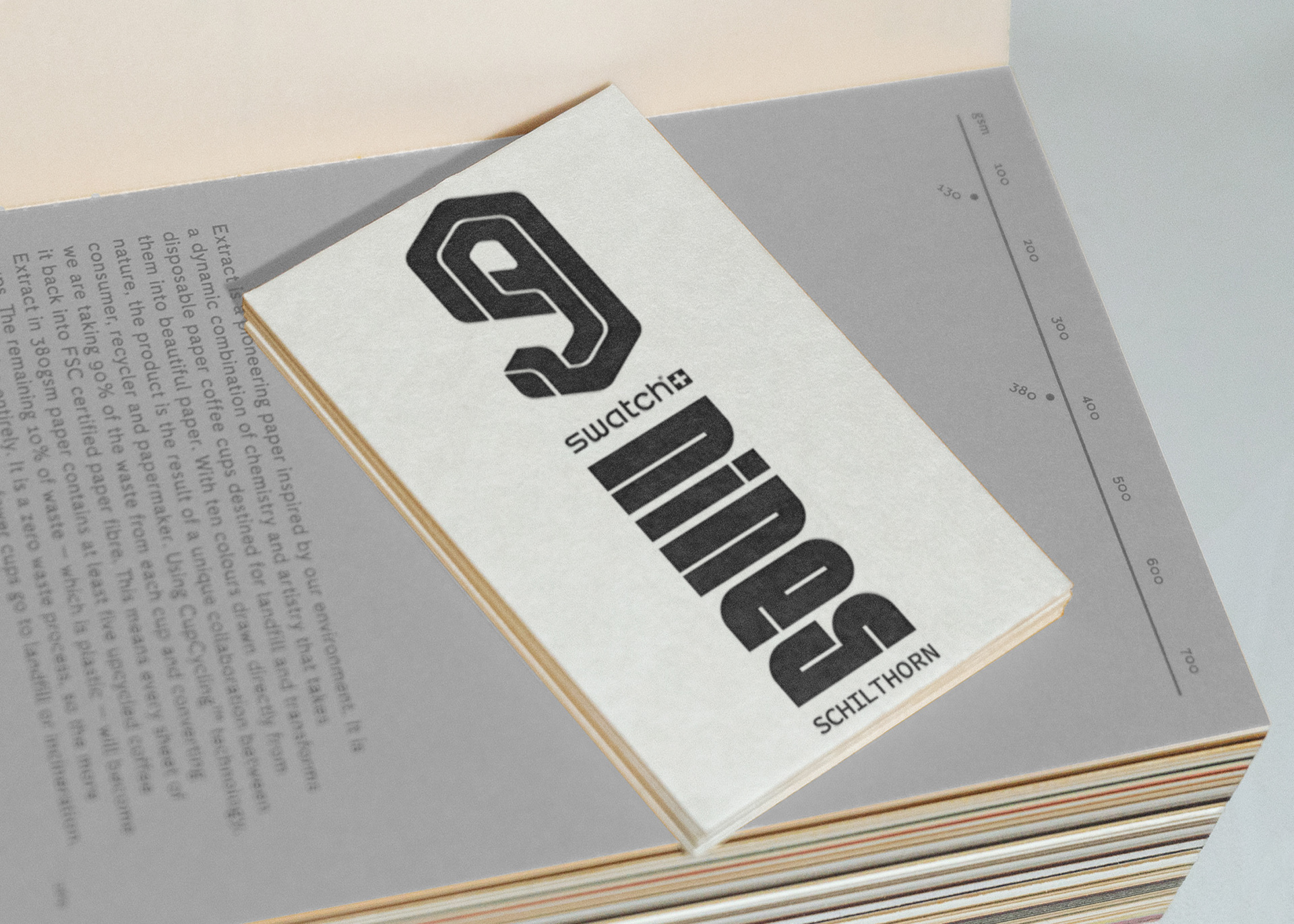
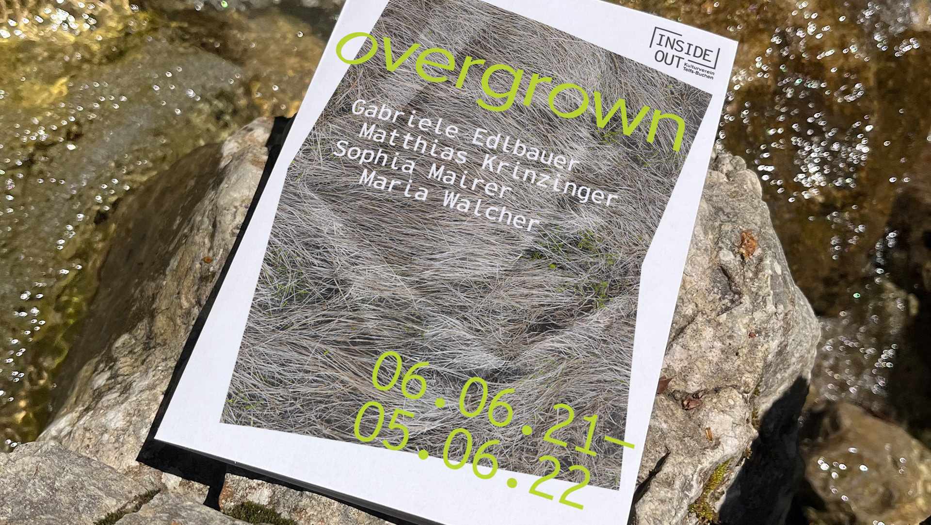
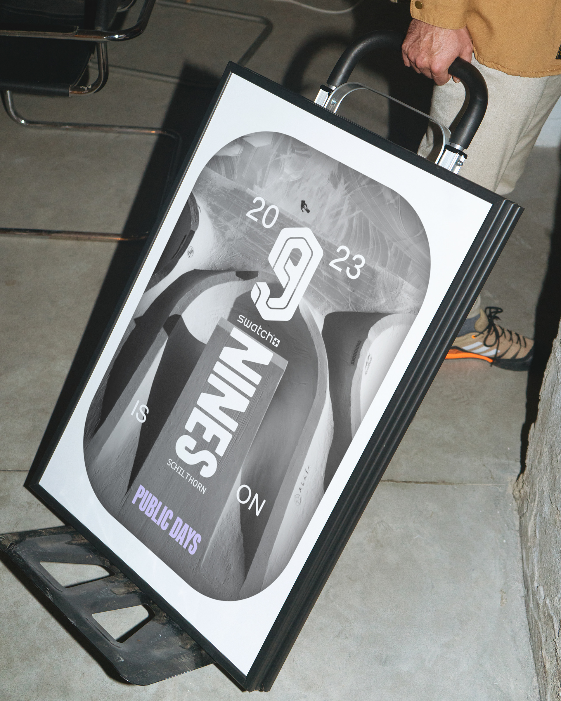
Inspired by the setup design, this logotype concept is an ode to both the Nine’s medieval themed origins [i.e. ‘The Return of the Nine Knights’] and its retro-futuristic vibe. Textures and overlays add a vintage, utopian feel to the event photography.