Agentur Wir Naming + branding + identity
Originally established in 2003 as ‘STMS Marketing Services’, the full-service advertising agency was revitalized in 2020 by a new, dynamic leadership team. The agency brings a functional approach and forward-thinking attitude to every project they tackle.
Seeking a new direction and an identity to match, they sought my help in 2021. The brief was to develop a name and brand that communicates the hustle and spirit of a young, thriving team. The aim was to create a functional yet playful identity that reflects an interdisciplinary creative team who believes in working collaboratively.
I translated the team’s energy and diversity into a dynamic system of form, colour and typography that can be as playful and as pragmatic as required by their application. The result is a straightforward, flexible framework, purposefully untethered from period or trend, that invites the team to explore and innovate within it.
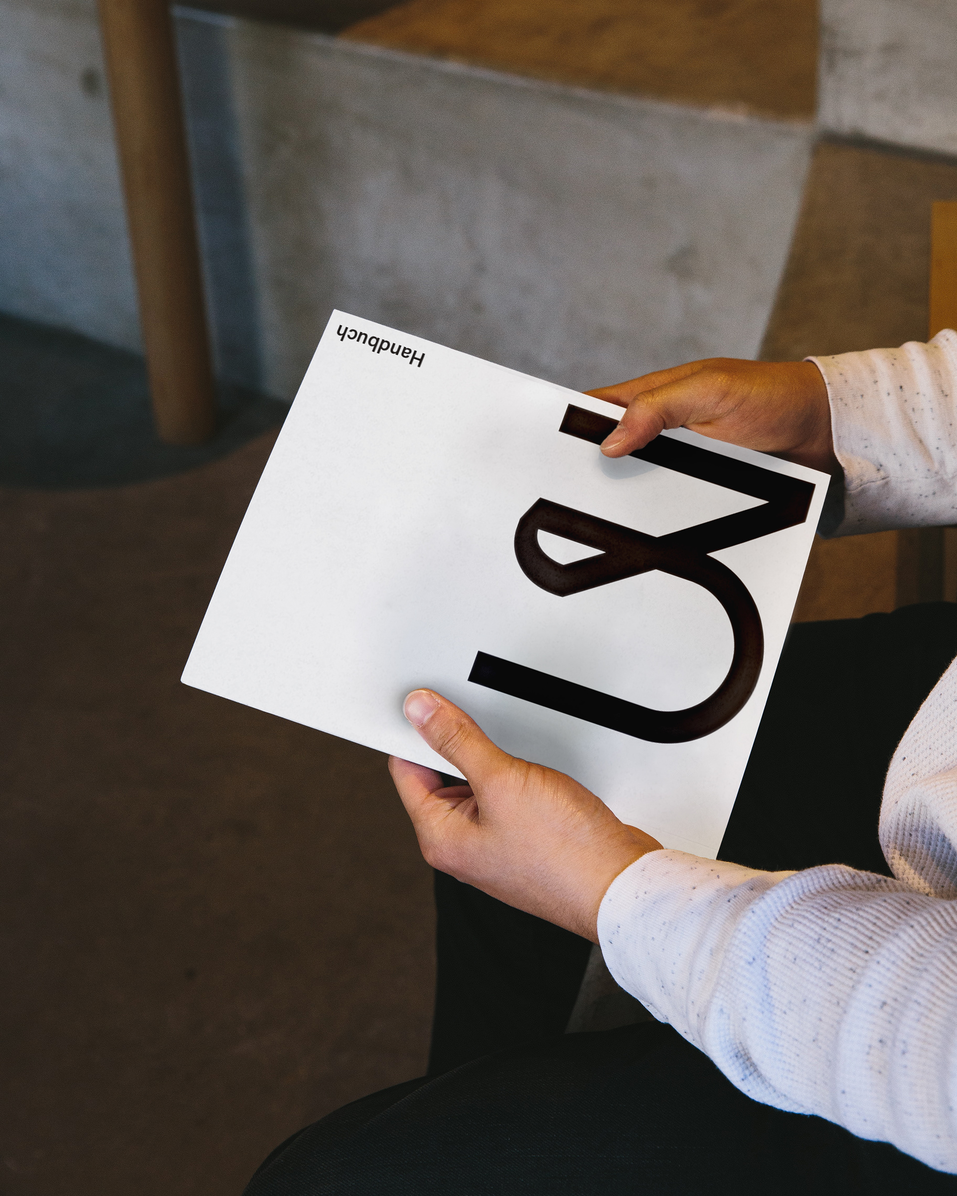
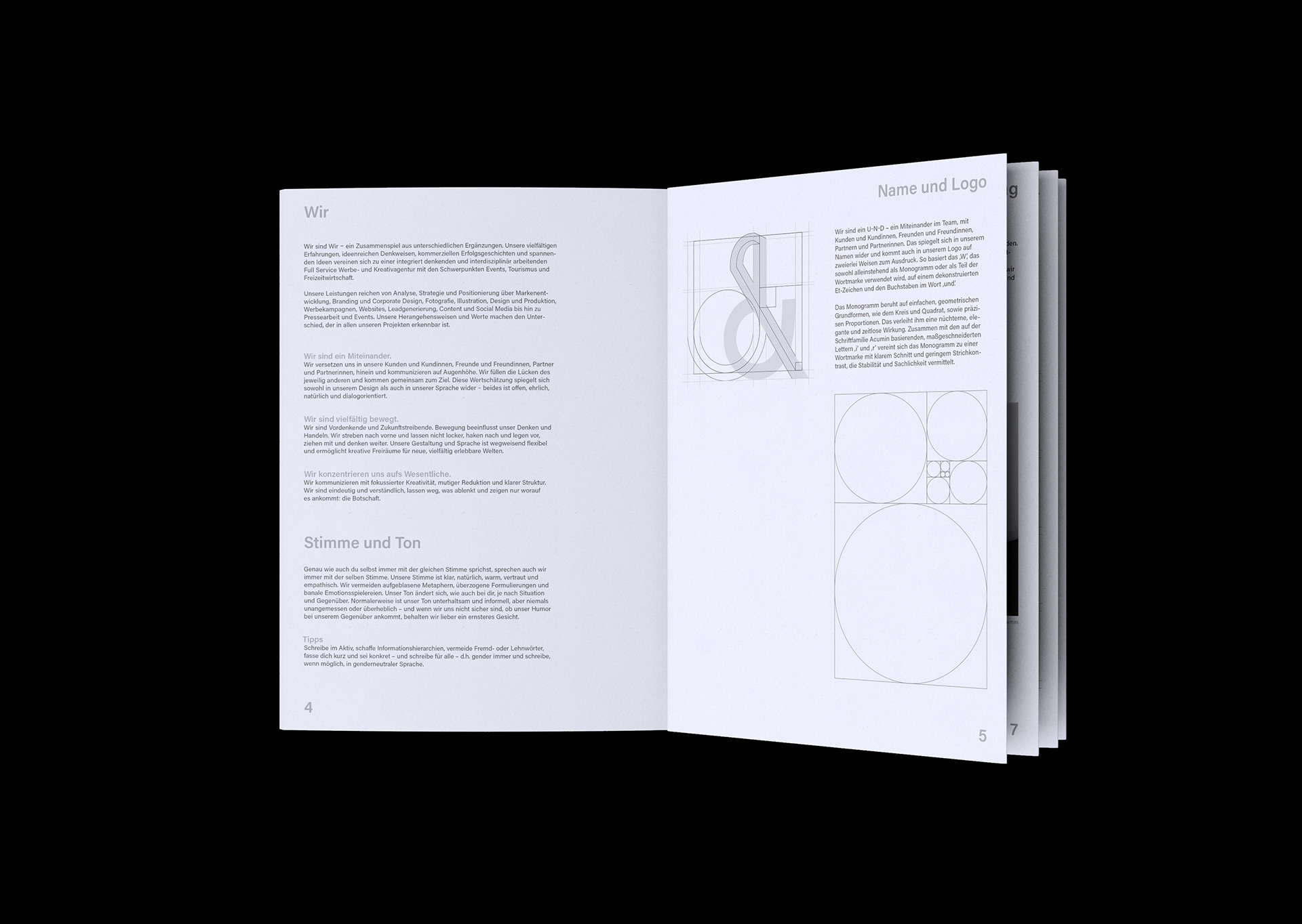
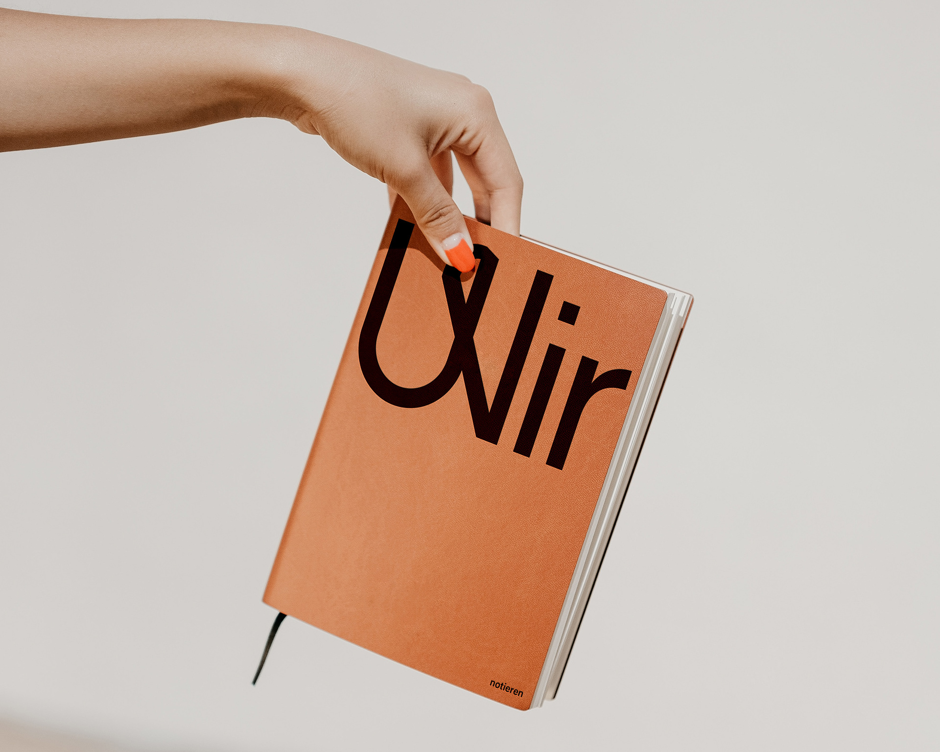
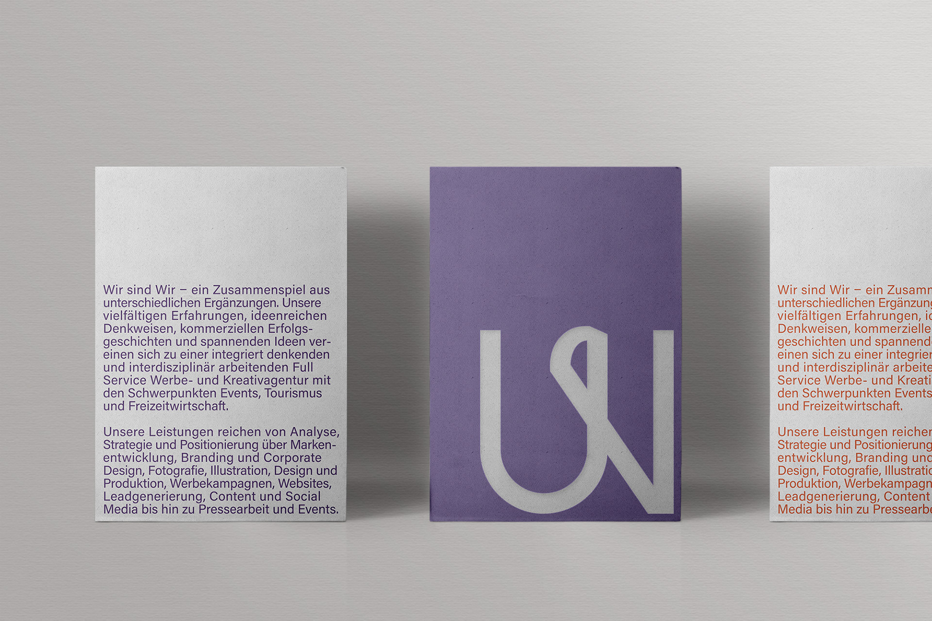
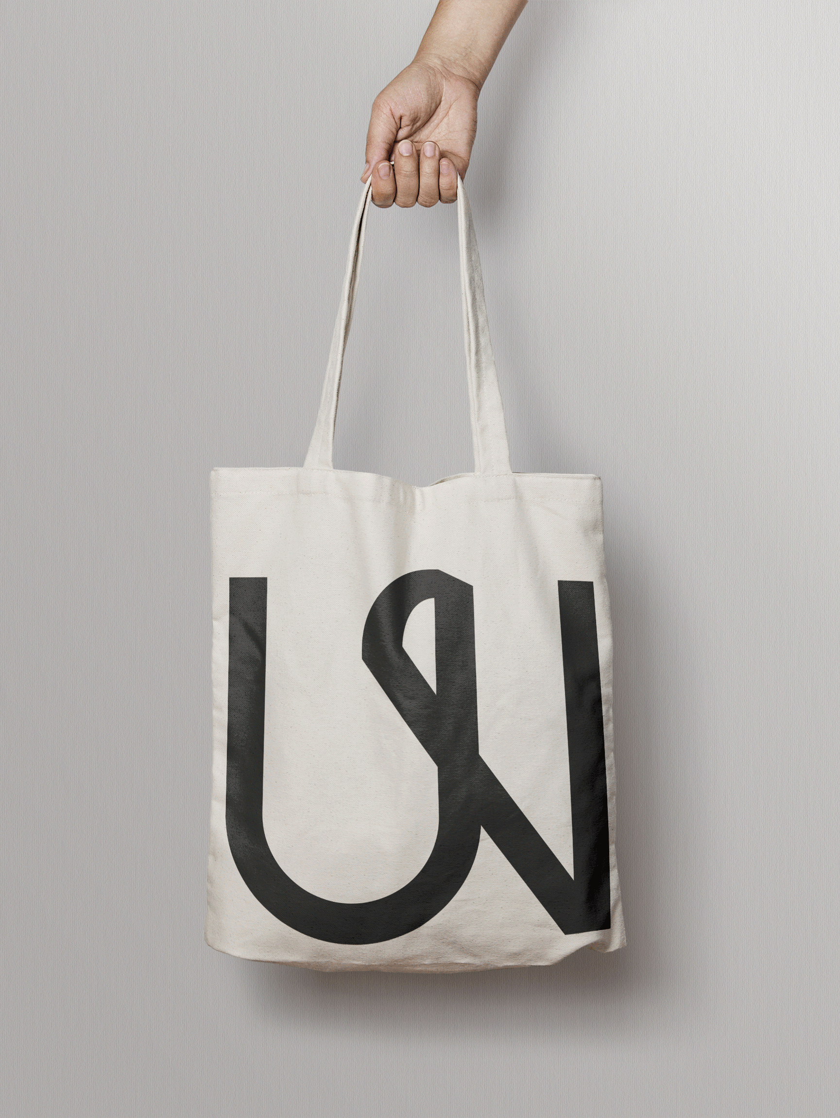
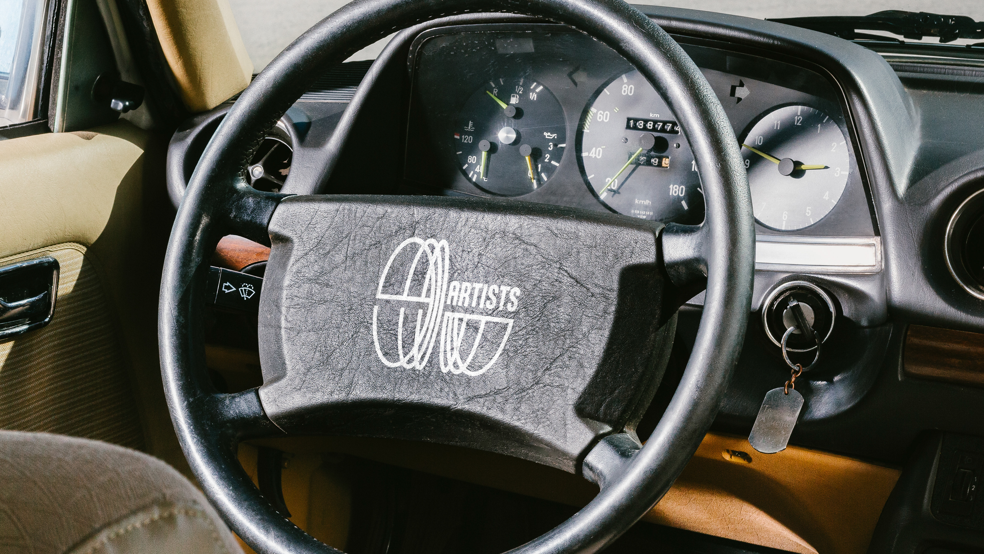
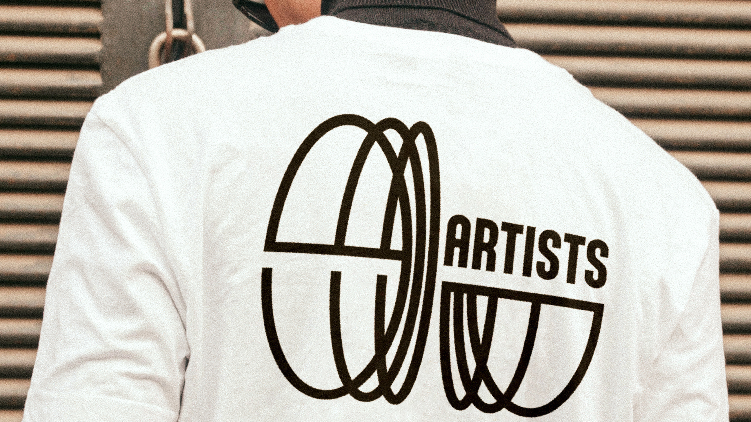
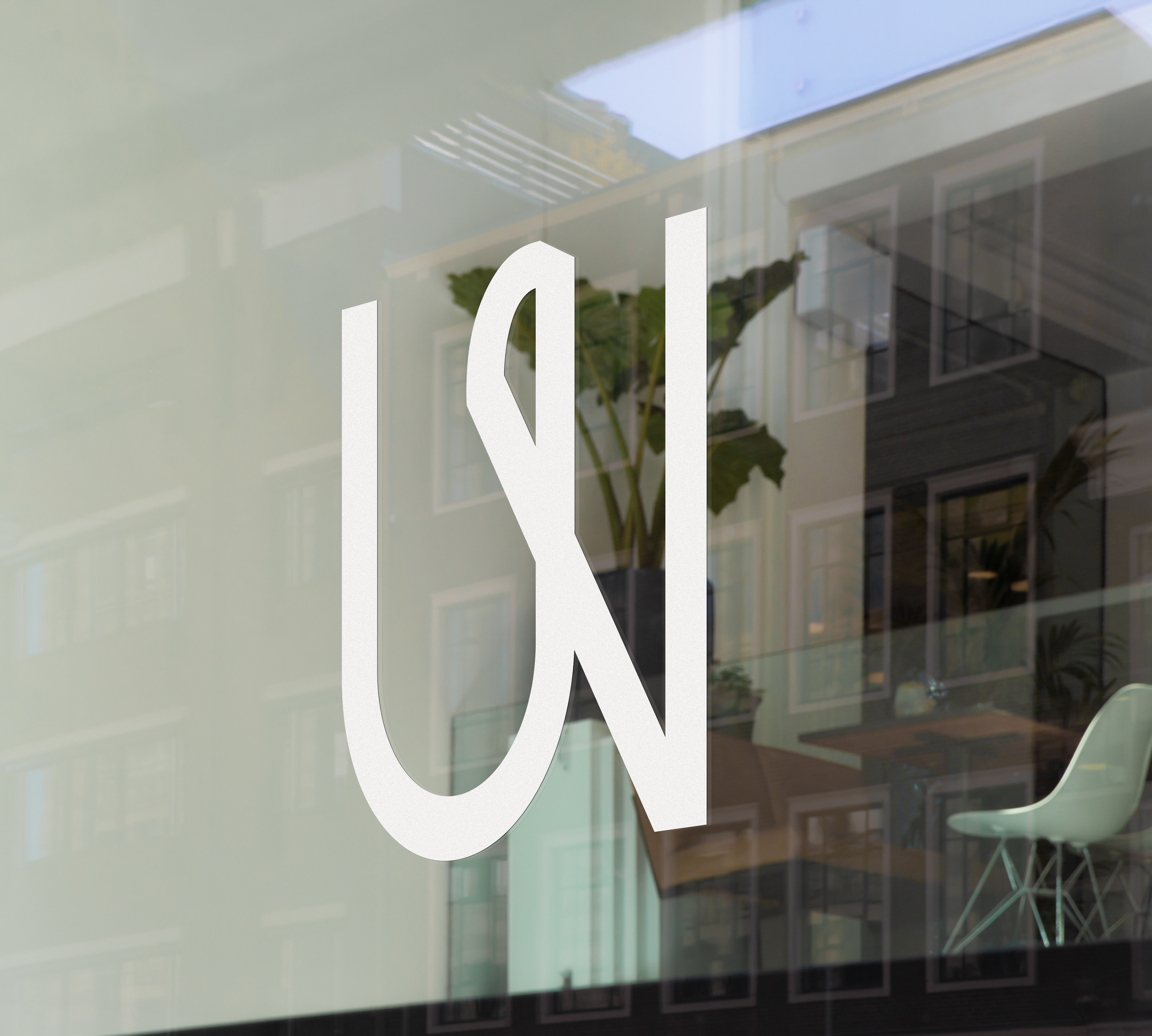
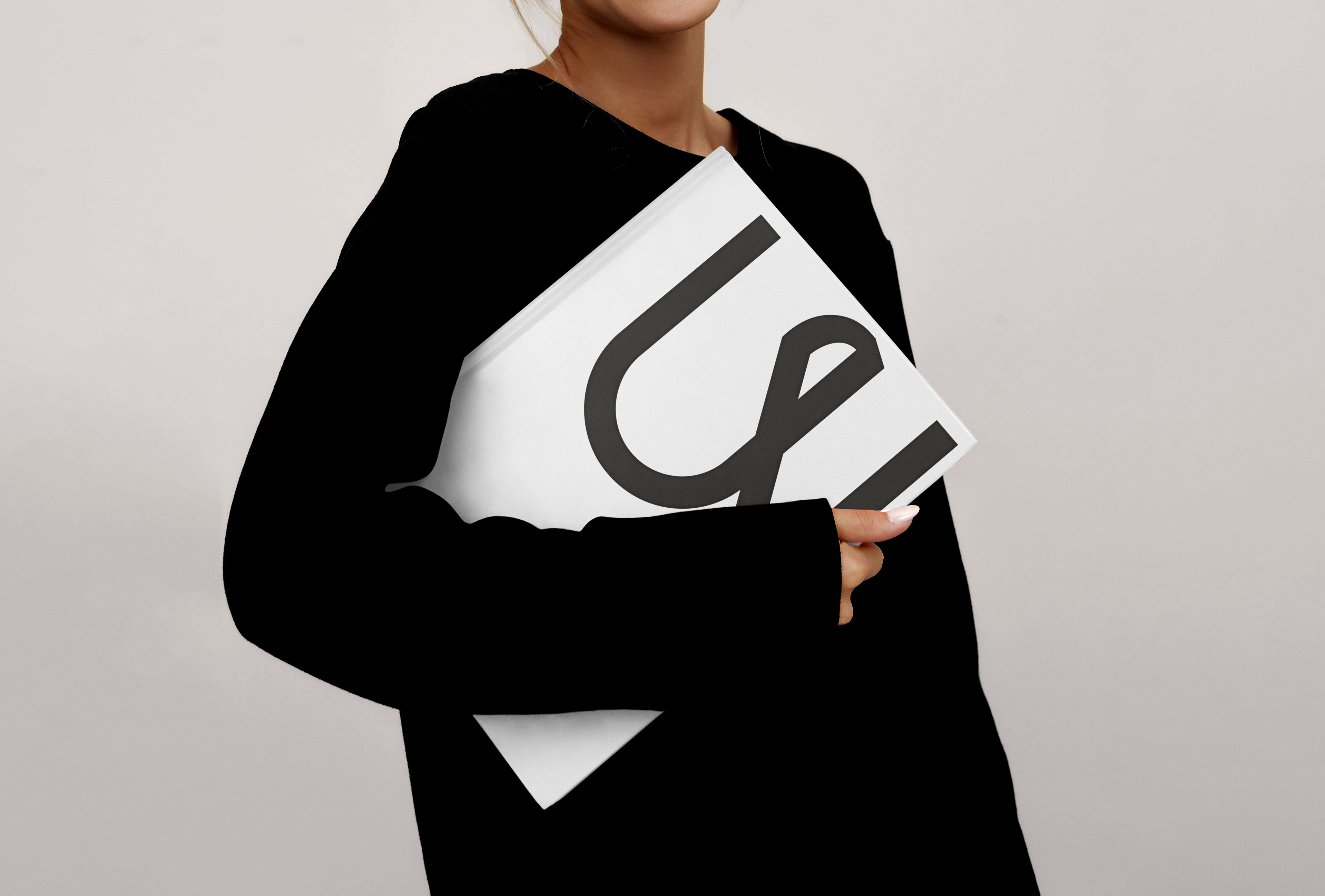
The bespoke wordmark and monogram are both sleek and personable, offering clarity and intent while remaining highly adaptable. Notably, the ‘W’ monogram references a deconstructed ampersand, subtly nodding to the German word ‘und’ [‘and’] and the agency’s collaborative spirit.
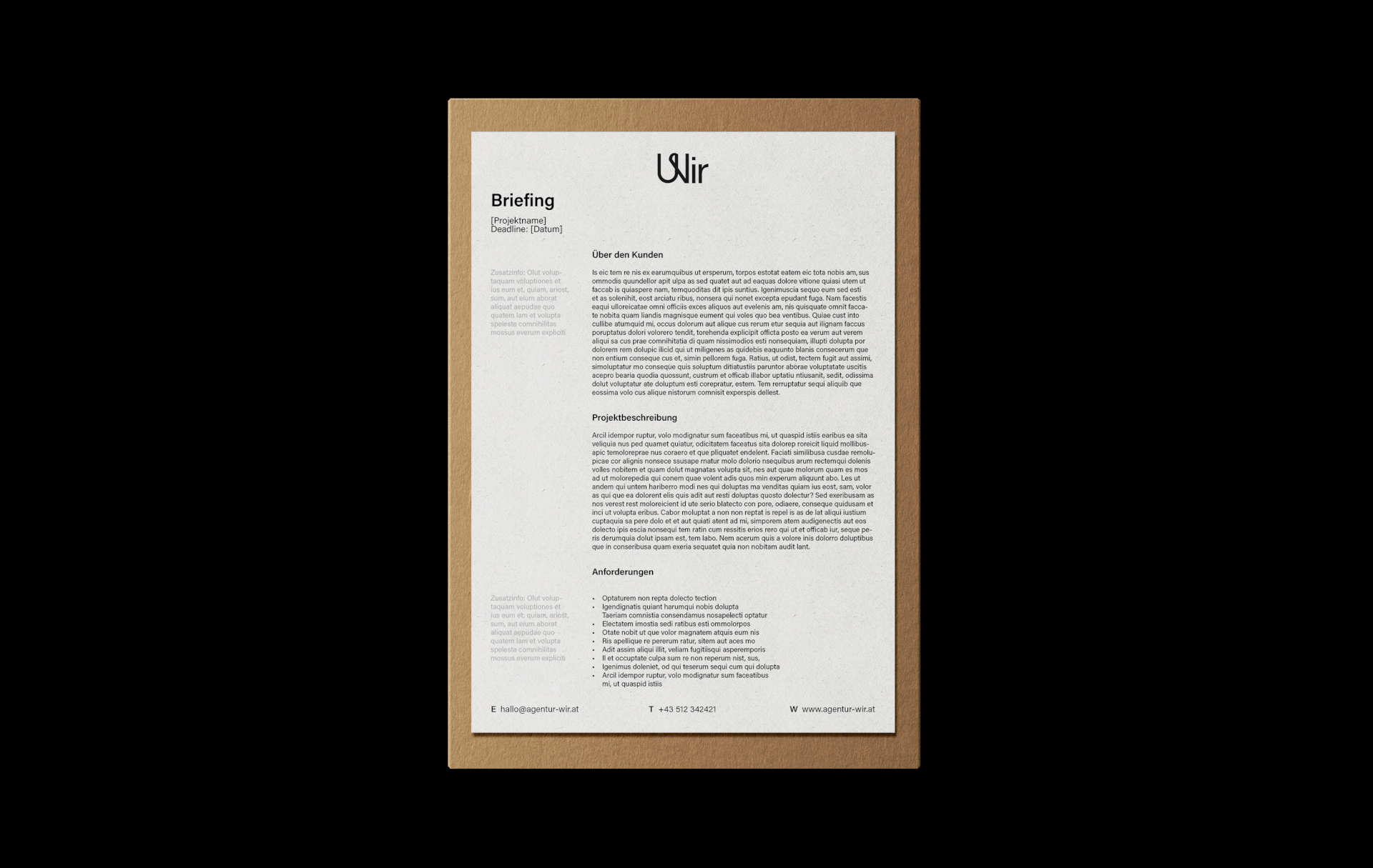
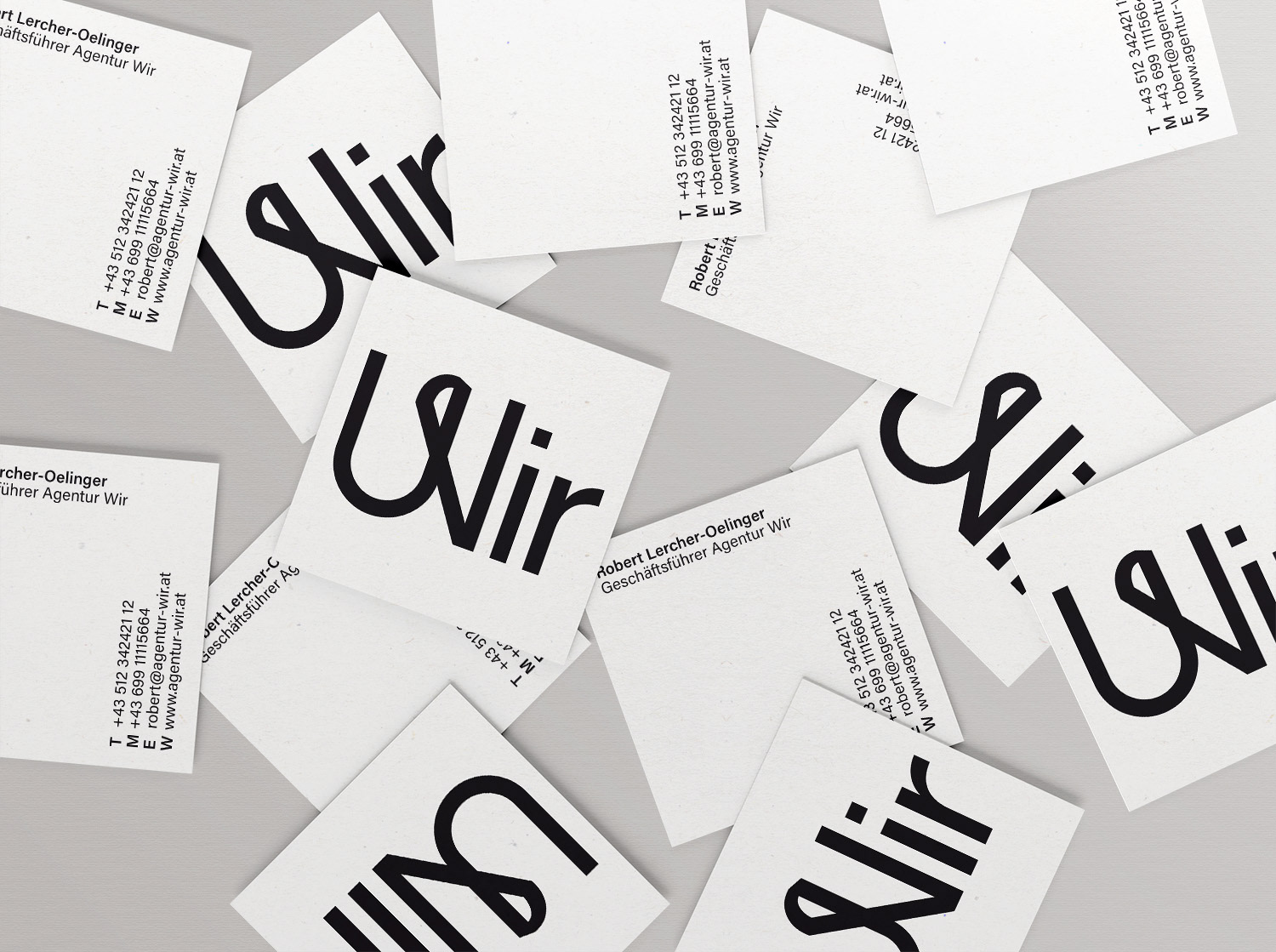
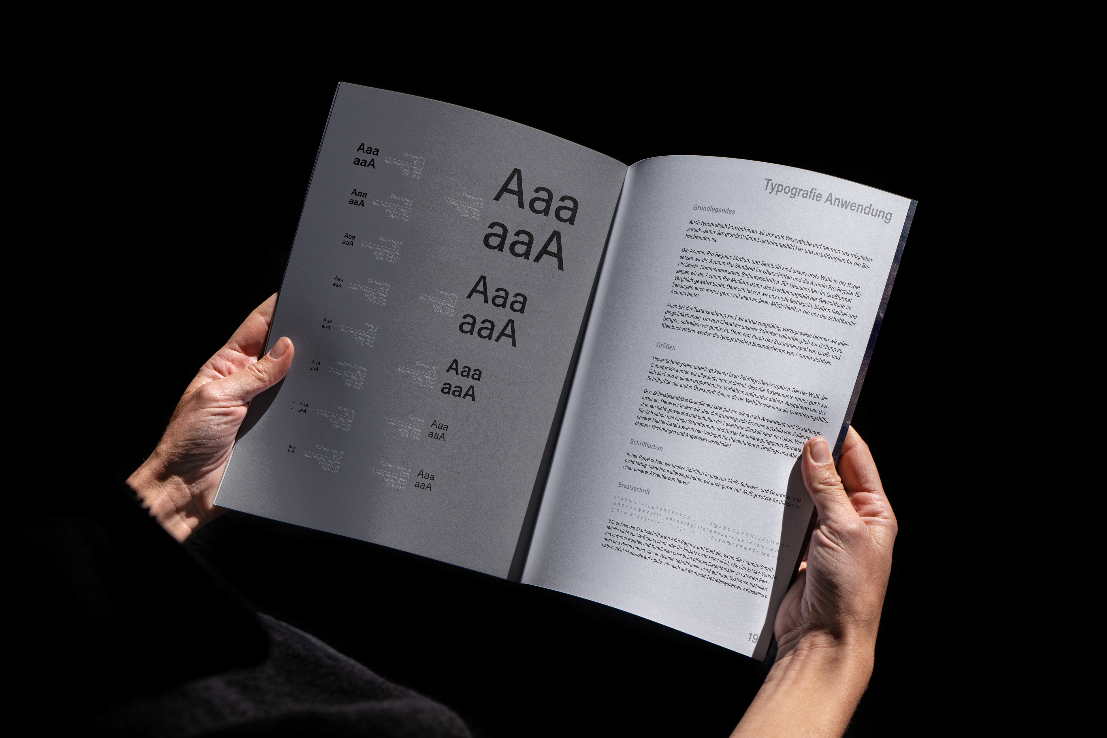
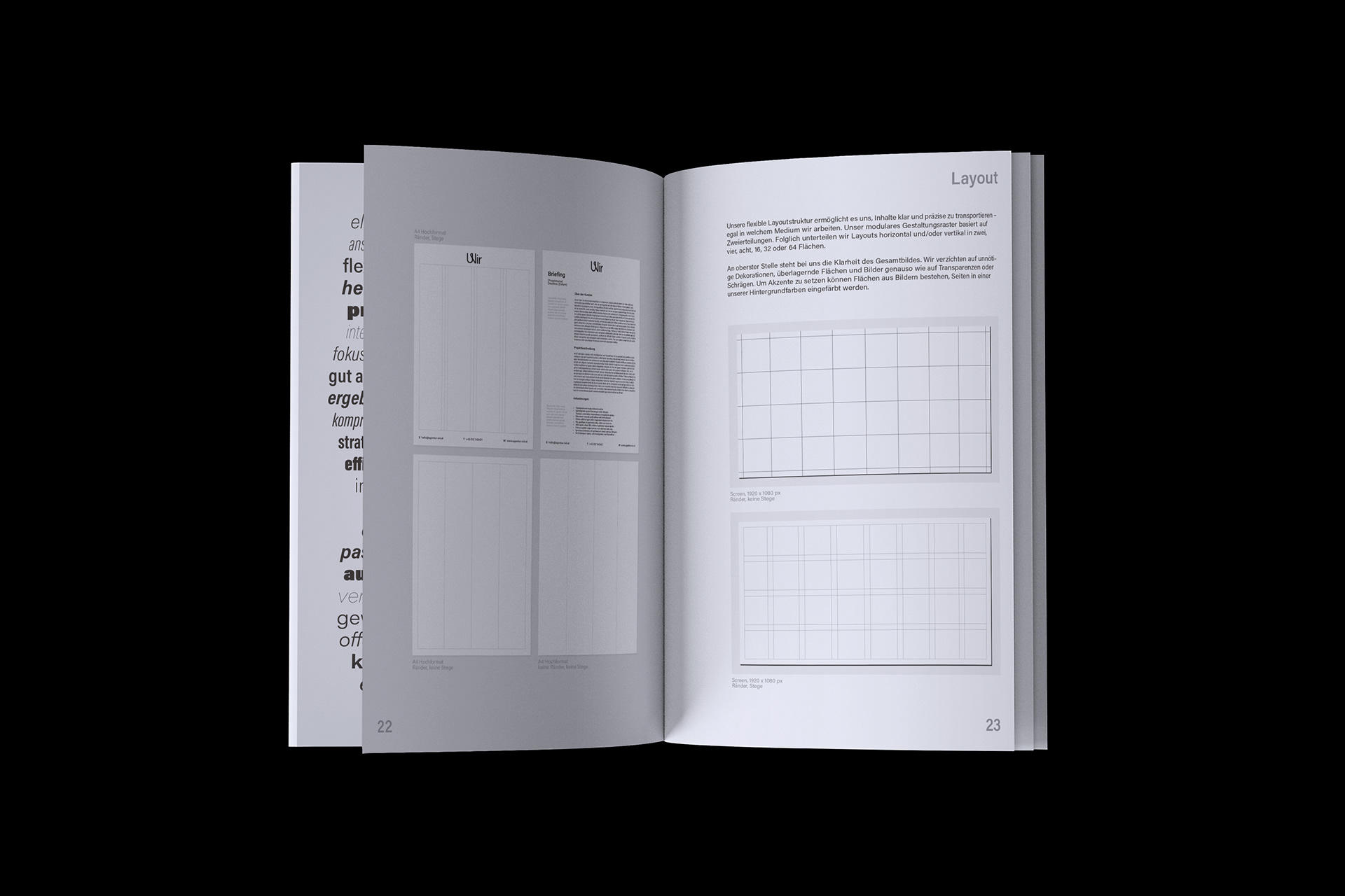
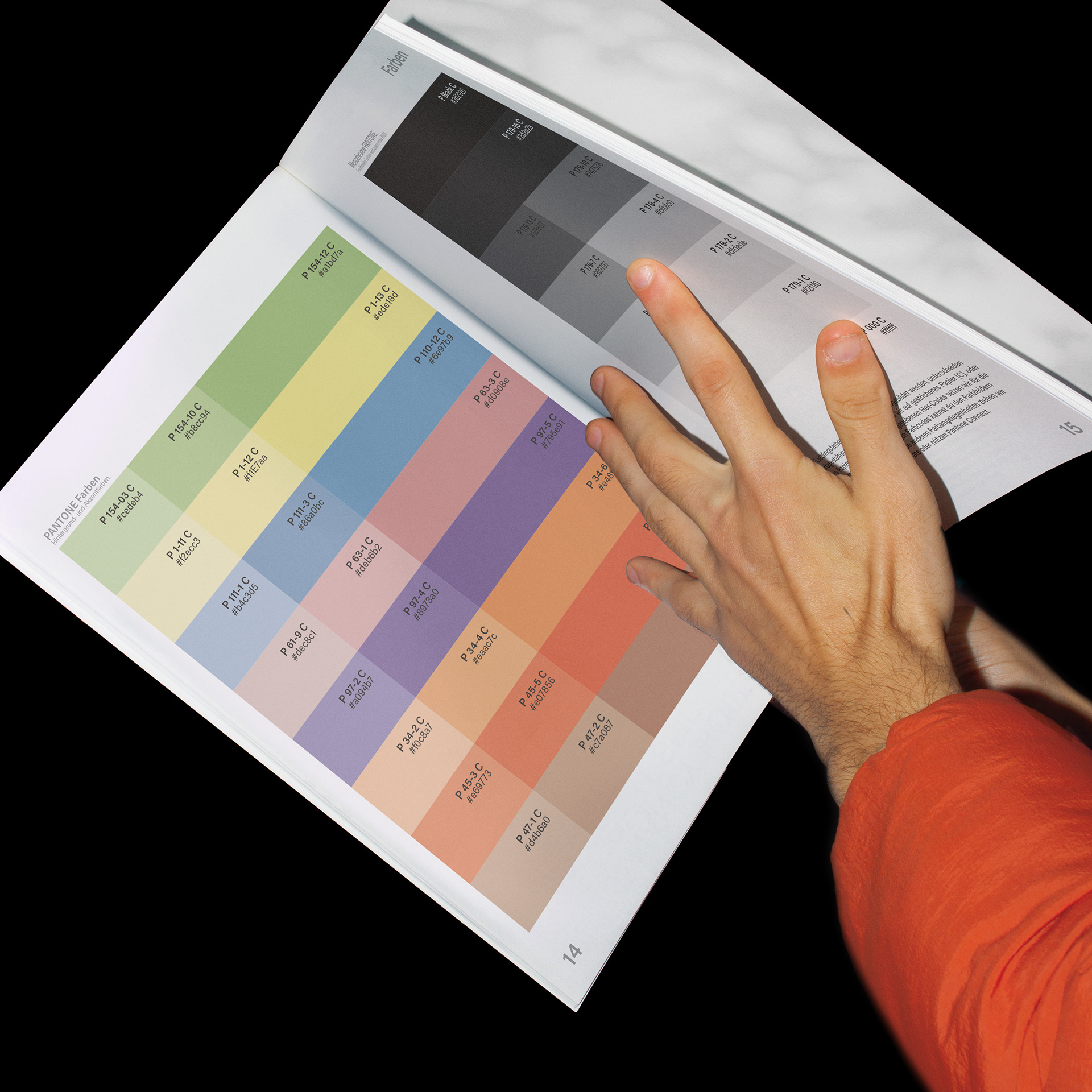
An energetic set of Pantone colours signals a diverse, ever-evolving agency, while the neutral, variable sans-serif typeface Acumin provides a practical foundation for the identity. The flexible grid provides a clear framework for all the visual elements and typography.