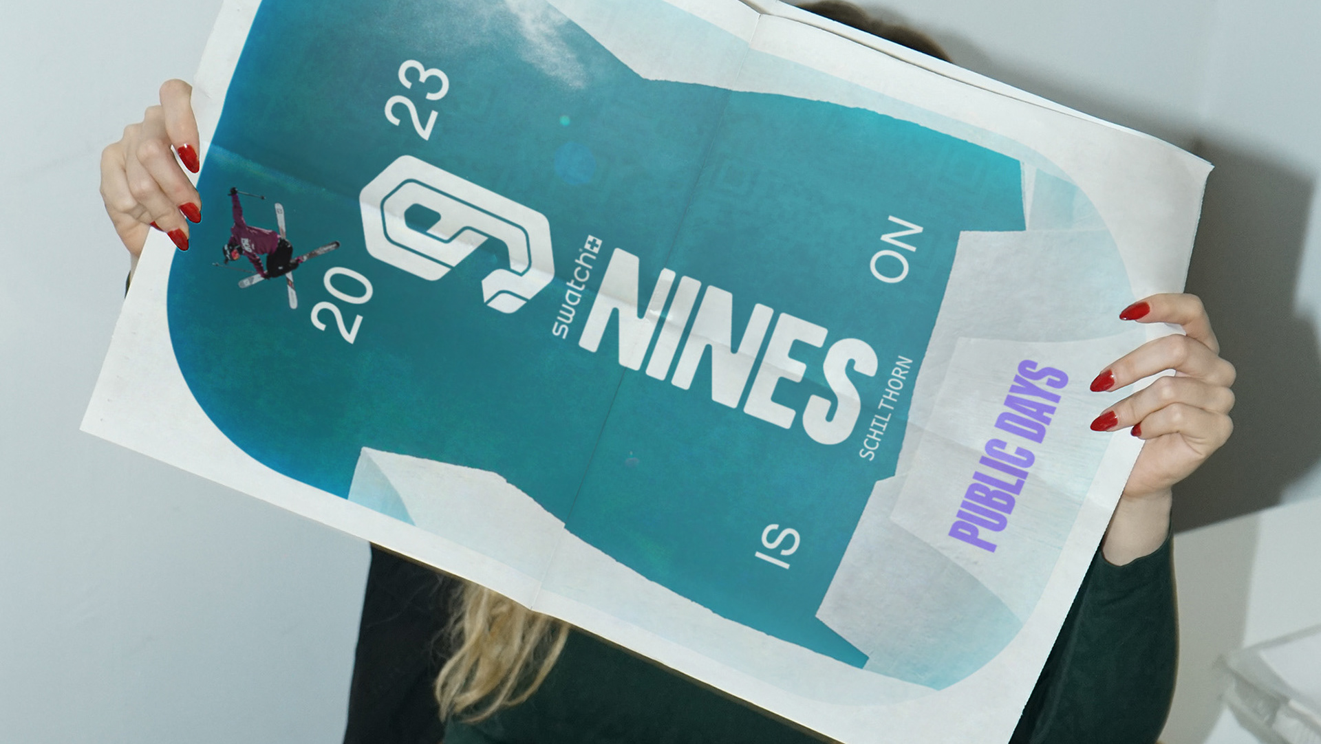
MuseumsPartner identity + website + copywriting
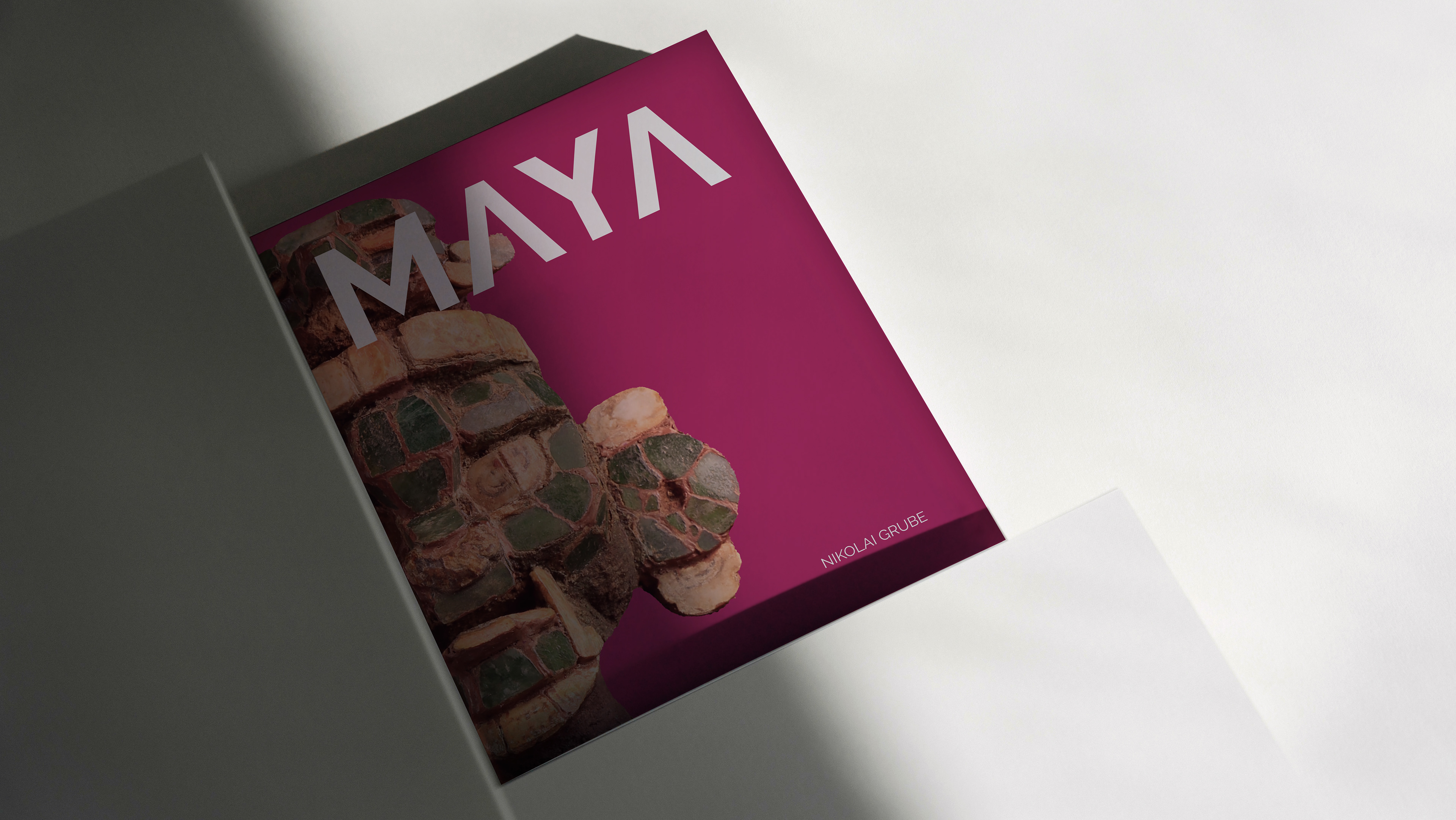
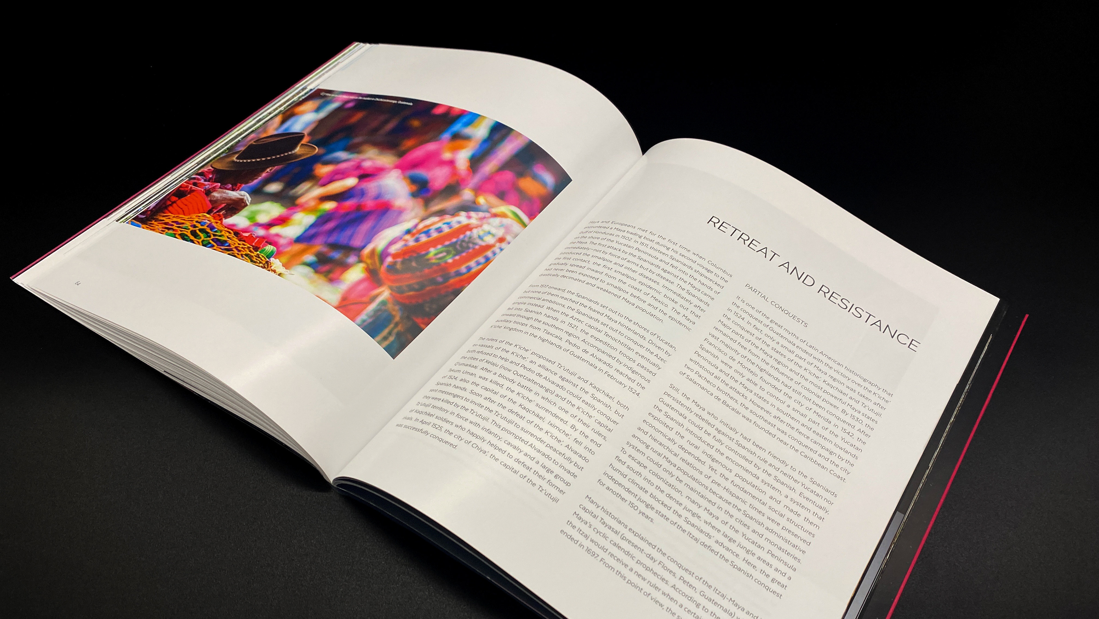
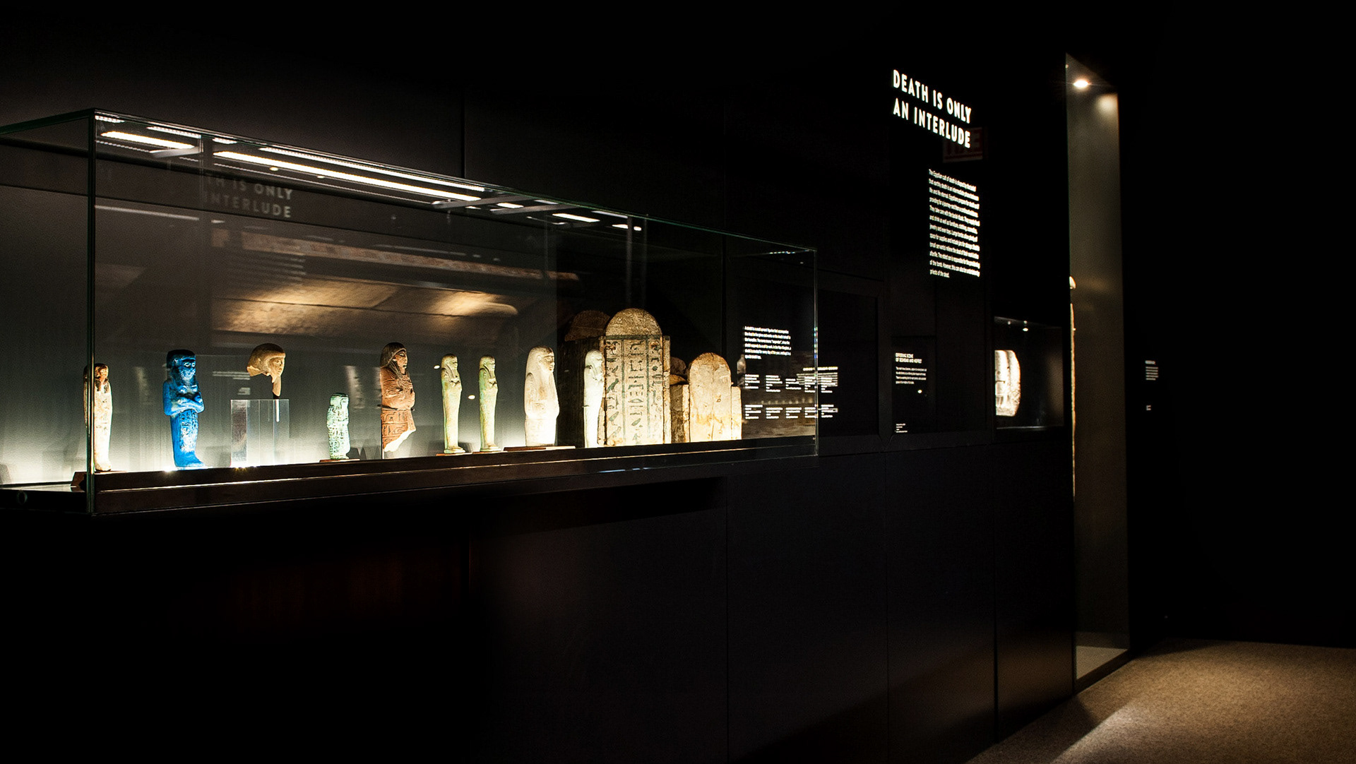
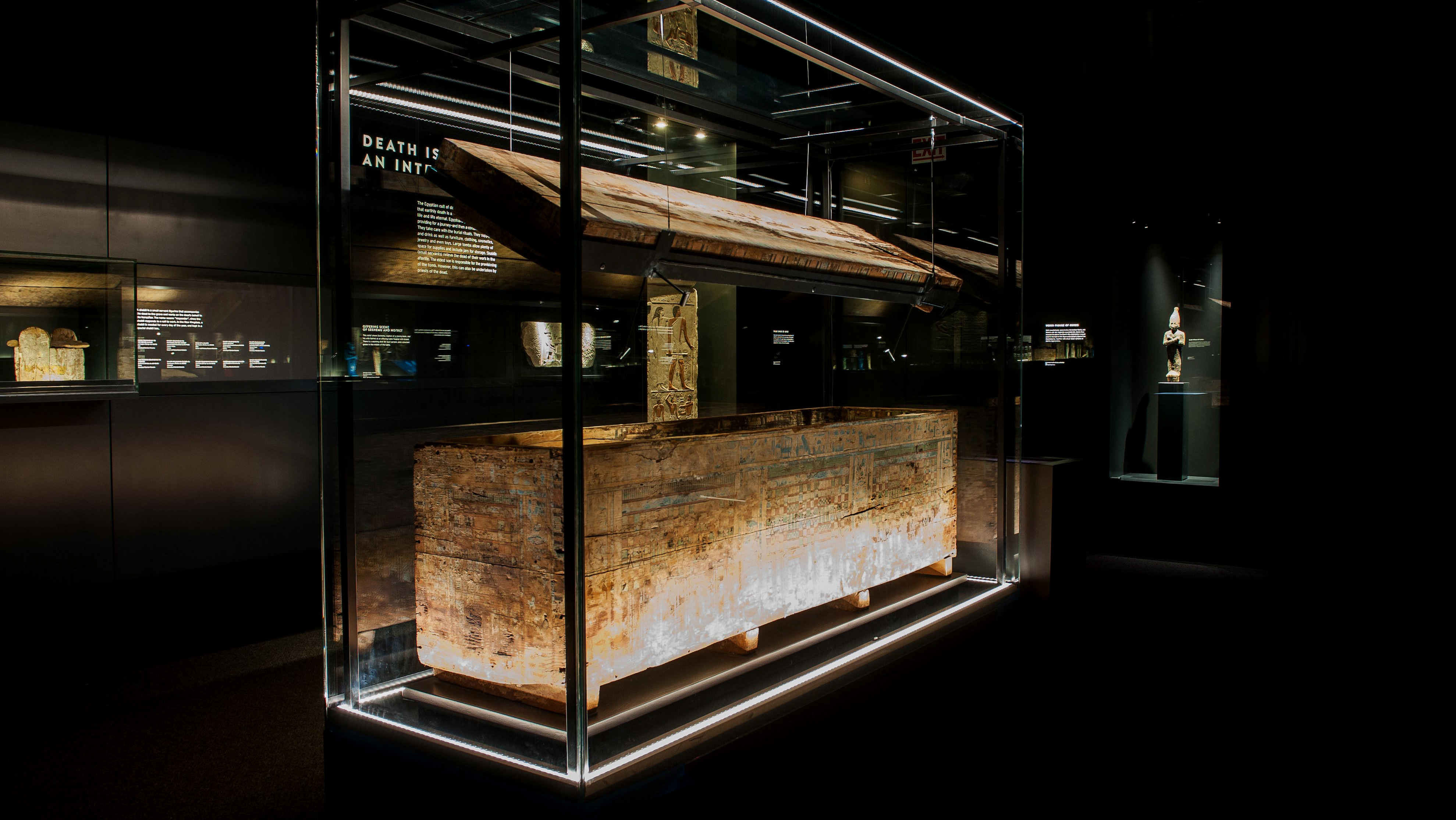
Museumspartner is a leading producer and provider of international travelling exhibitions, as well as a specialist in fine art logistics and storage. The team was seeking a more colourful, contemporary look — one that could effectively showcase their diverse array of fine art and exhibition services, while maintaining a consistent, confident, professional voice.
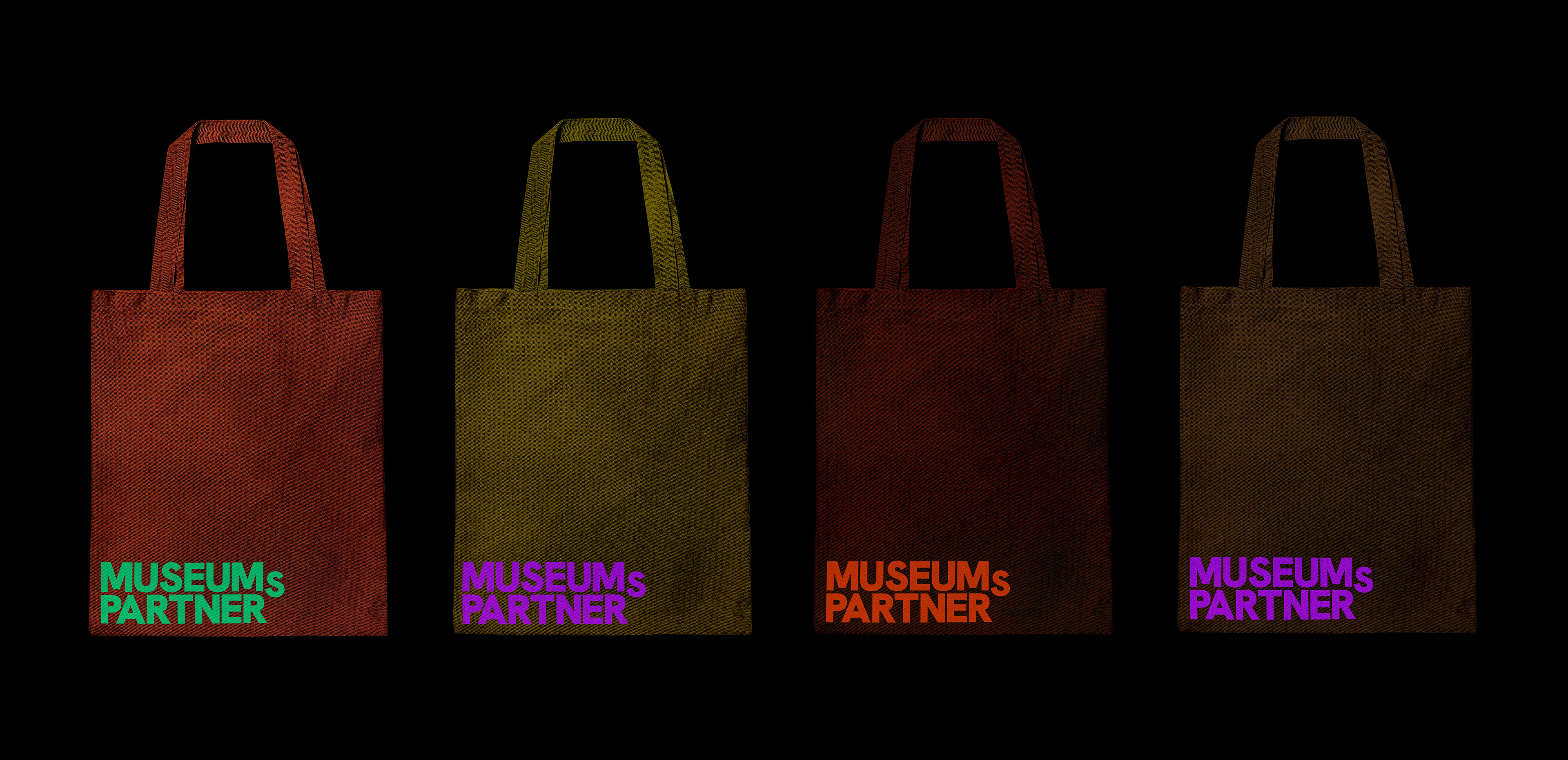
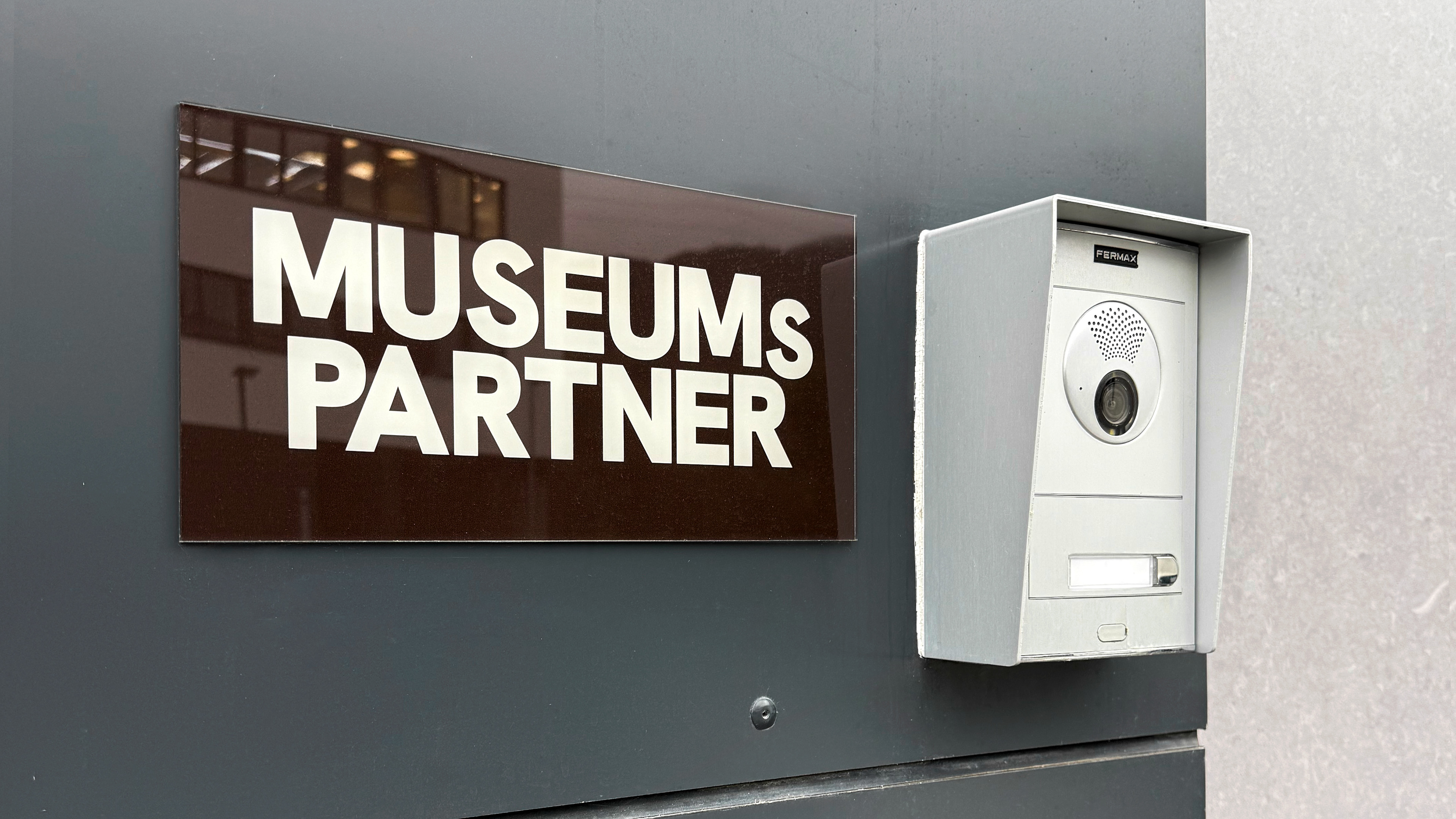
In a subtle reimagining of Museumspartner’s identity, an interplay of earth tones and striking neon colours leads the design, representing both the diversity and sophistication of the company. Hanken Grotesk adds strong personality, particularly its uppercase letters, while maintaining a neutral, professional aesthetic.
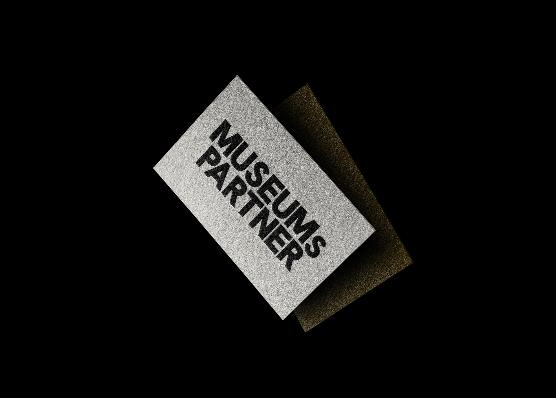
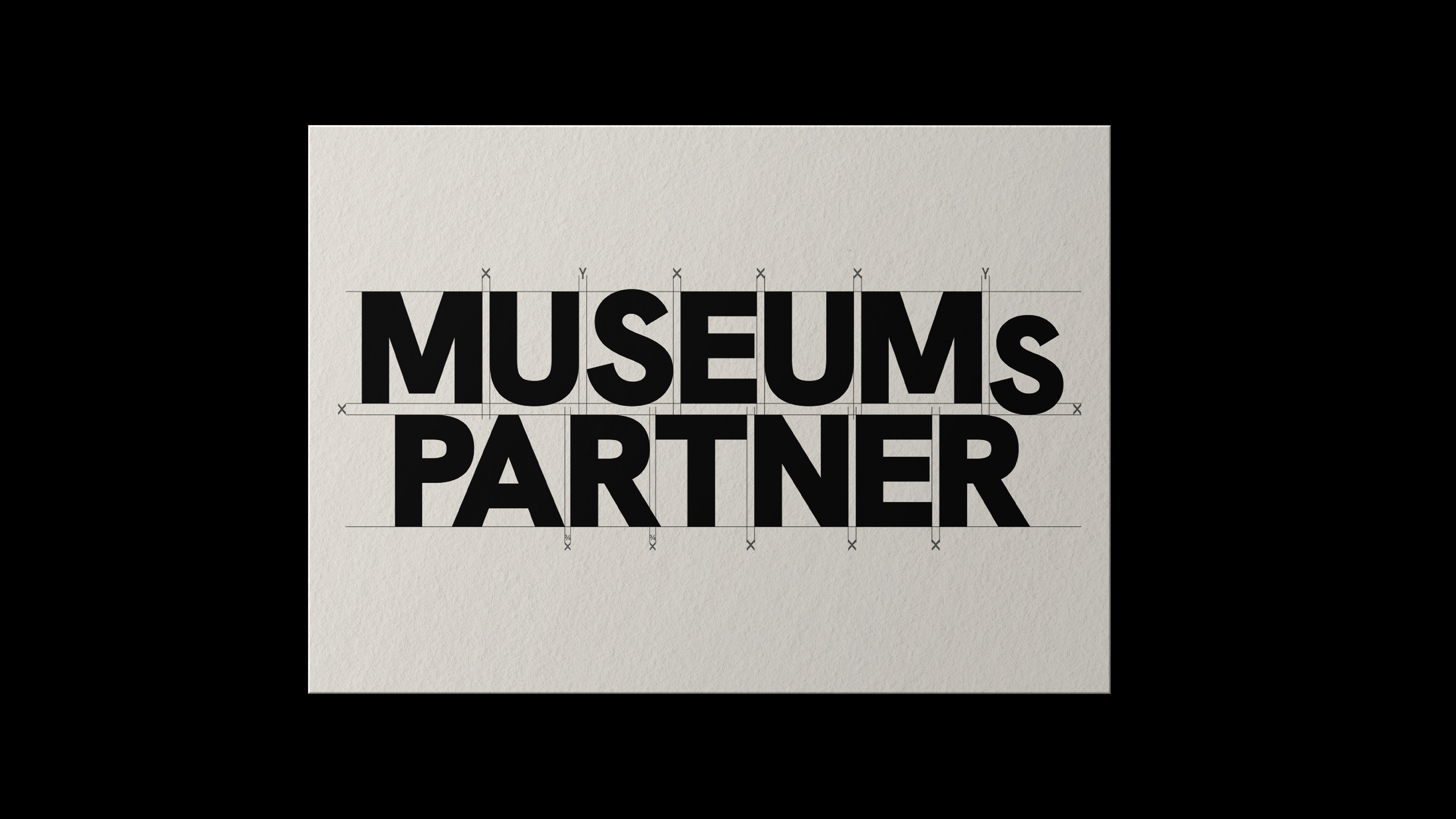
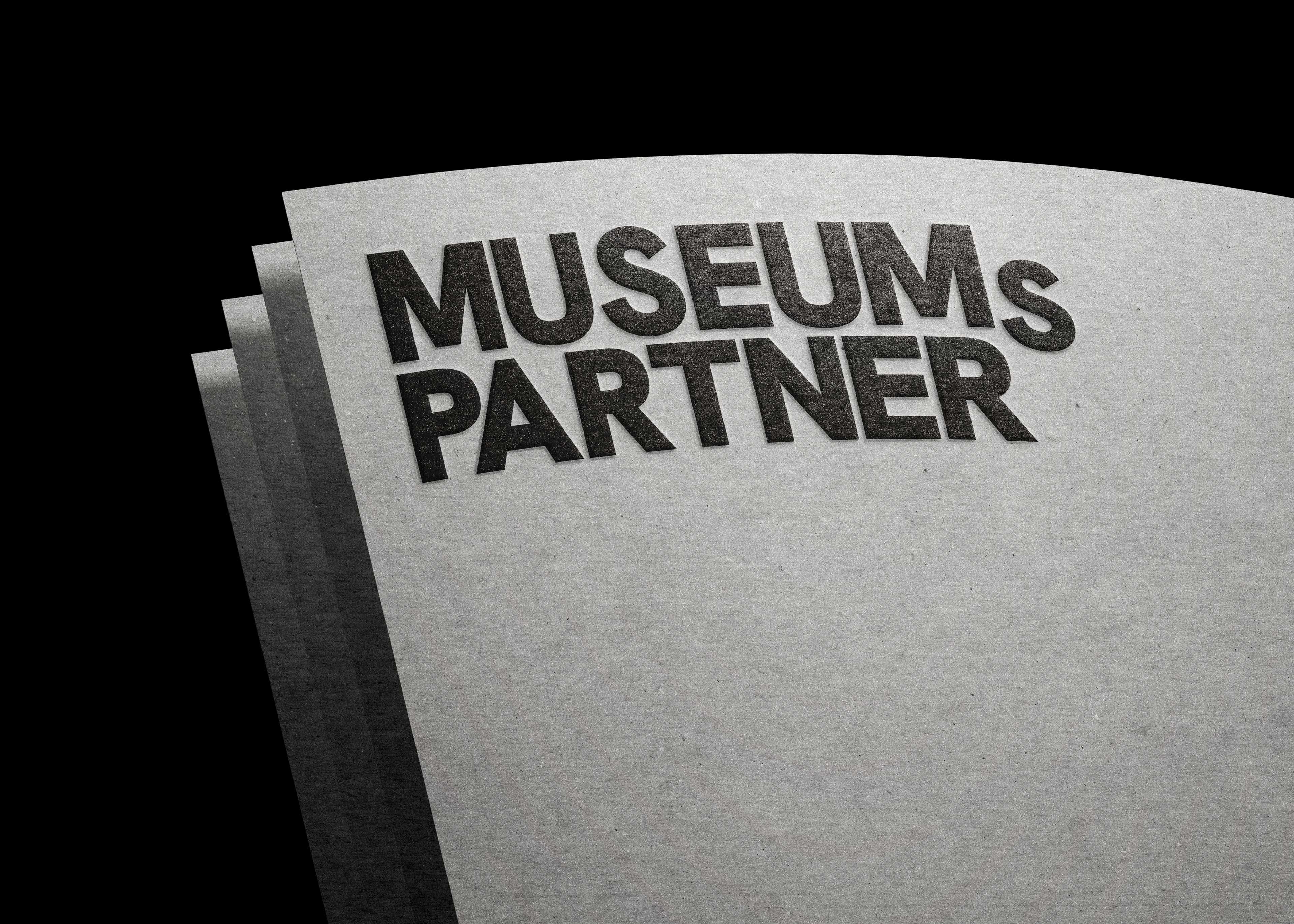
The new quiet, yet confident, wordmark based on Hanken Grotesk Extra Bold drops the ‘s’ in ‘Museumspartner.’ This makes the company’s [German] name not only readable for international audiences but also introduces more fluidity and playfulness, emphasizing the personal, humanistic elements that differentiate Museumspartner from its competitors. Their original monogram was refined, its shape slightly tweaked to create an outline version as sleek as their new wordmark, while preserving its original charm.
The new brand identity is woven throughout every aspect of Museumspartner’s digital presence. Their new website embraces an editorial-inspired layout, enhancing user engagement through structured typography, a balanced colour palette, refined visual elements and scroll effects.