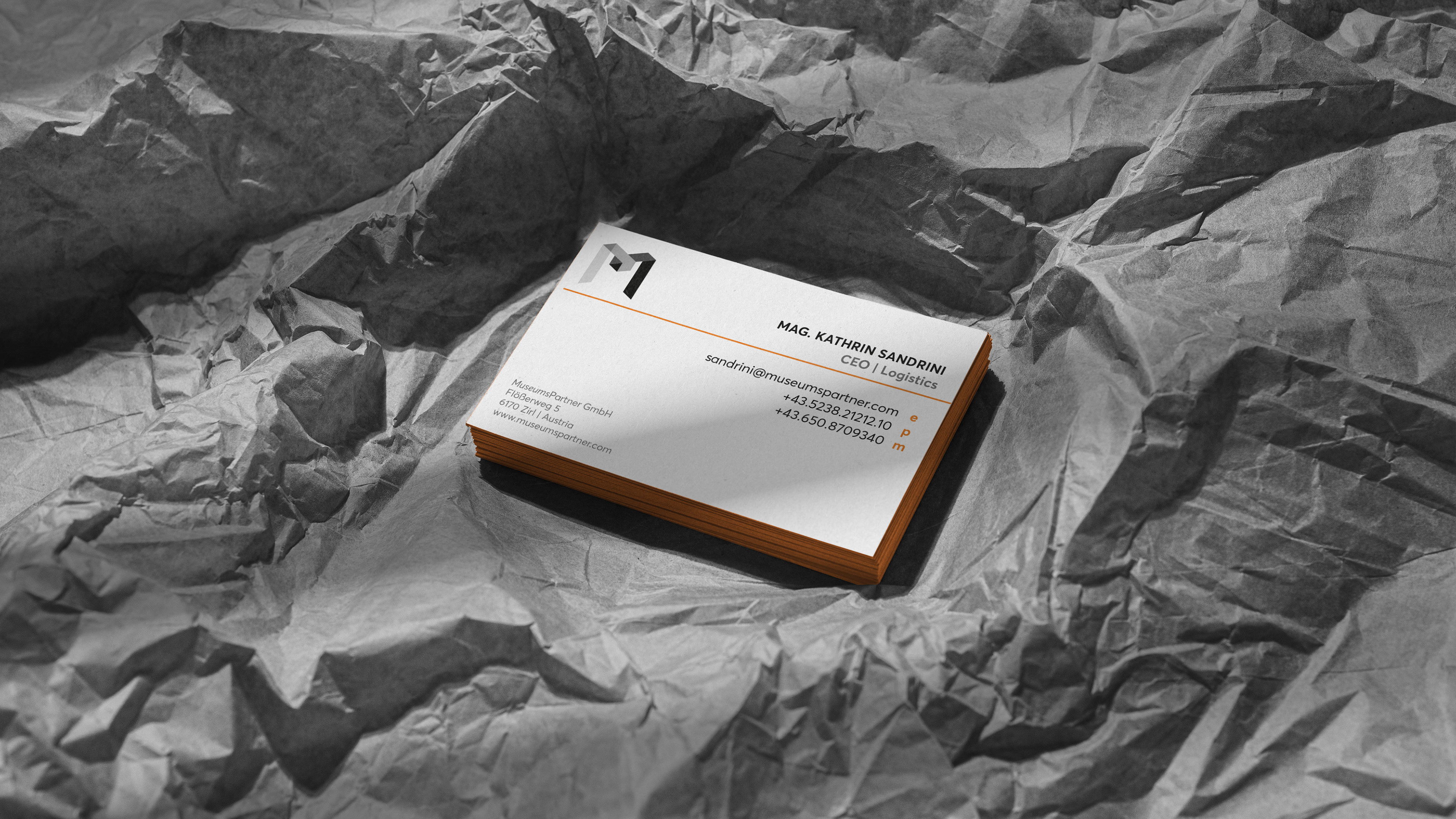
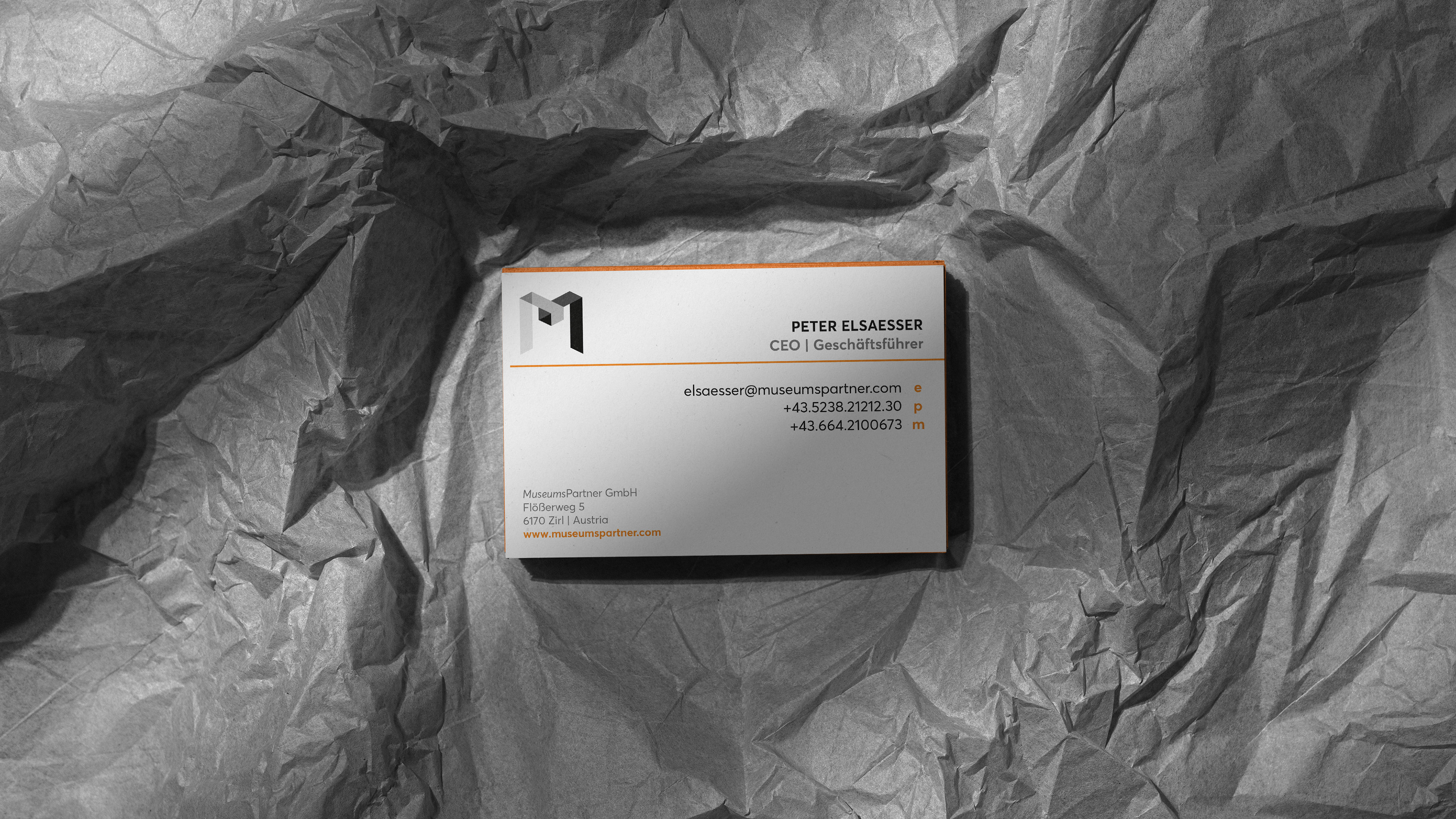
MuseumsPartner Identity refresh + campaigns
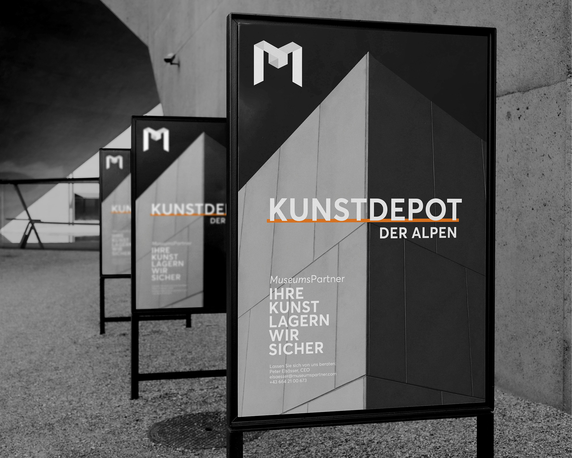
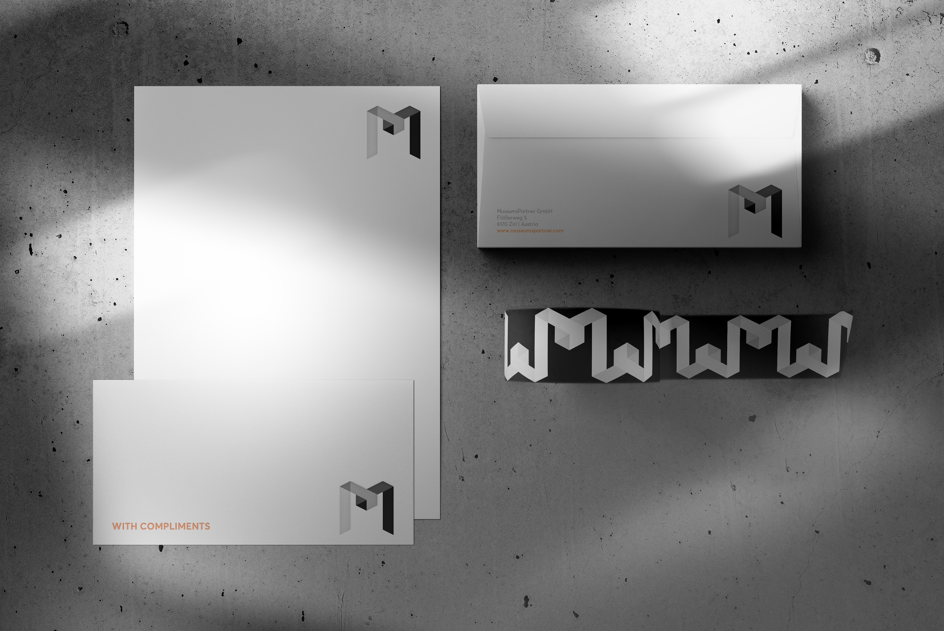
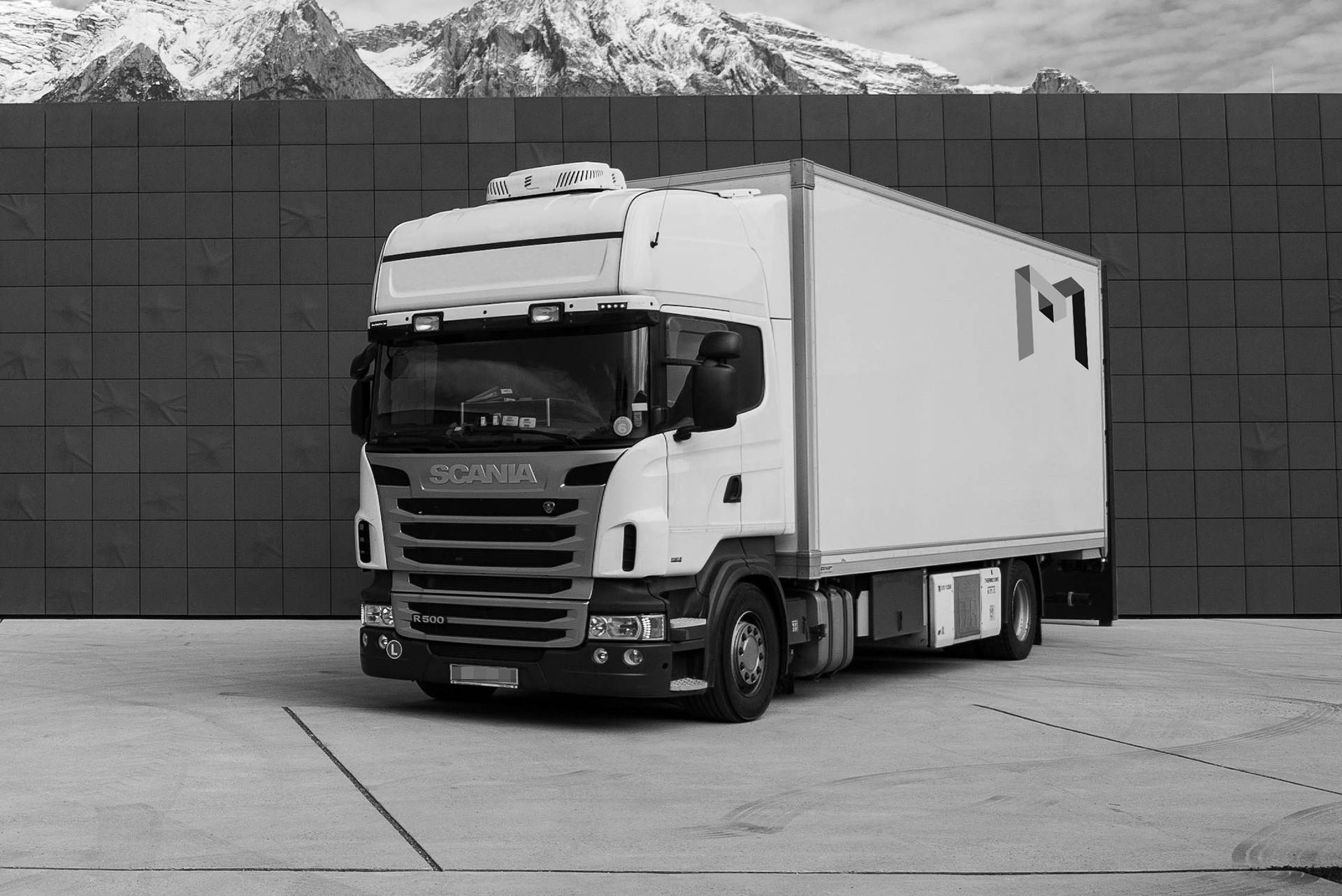
MuseumsPartner is a leading fine art transport company and producer of international travelling exhibitions. They wanted a more sophisticated look that conveys their expertise and professionalism and retains a visual connection through their monogram logo.
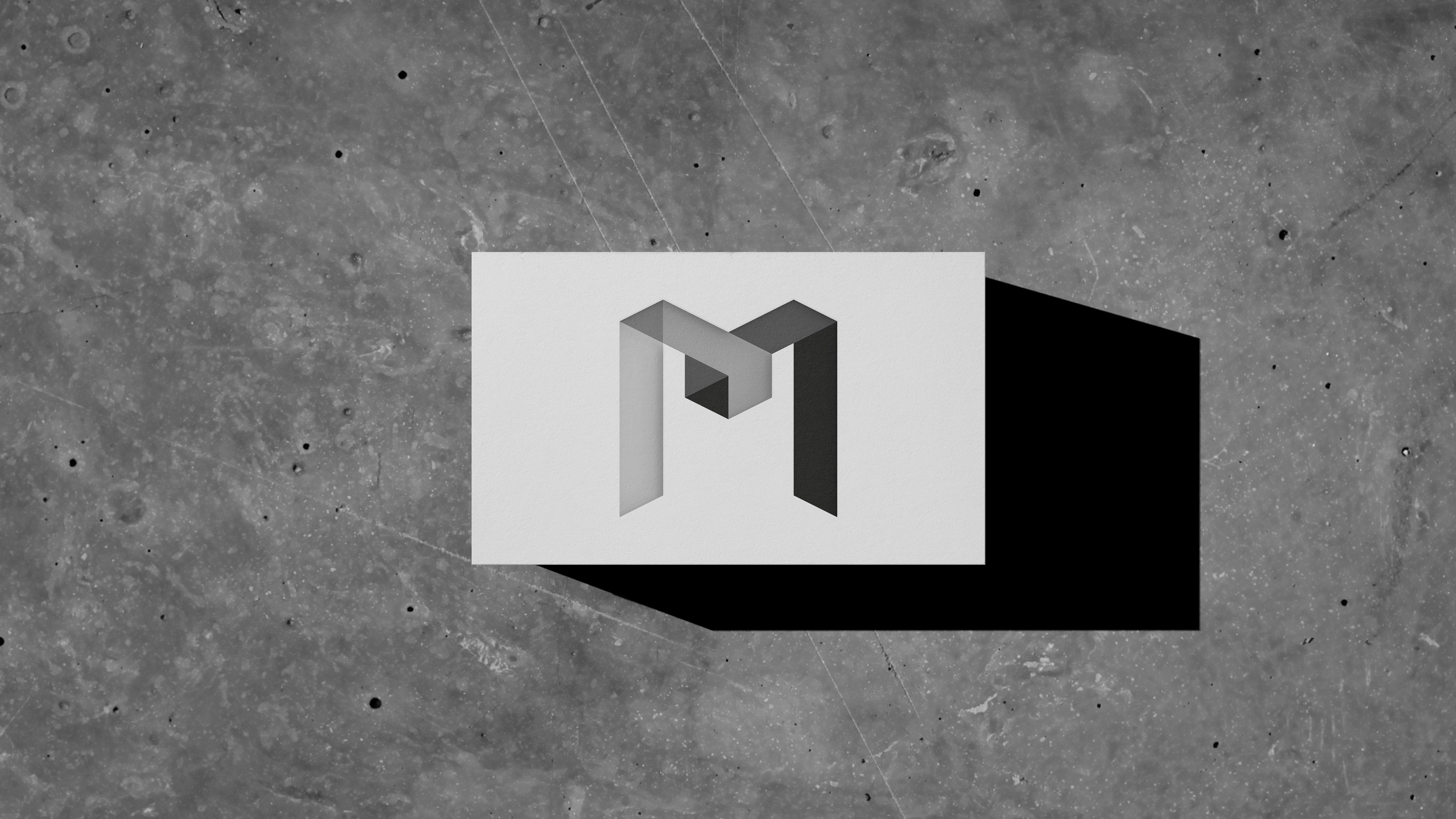
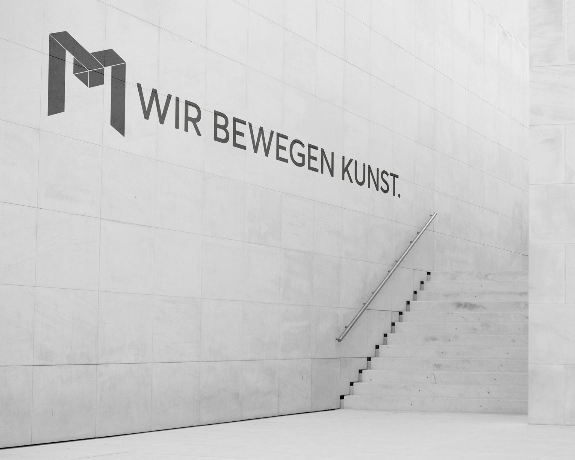
My response was a clean, minimalistic treatment in the minimal palette of black, white and orange, which is complemented by the original shades of grey of their monogram logo. The slight changes in shapes and colours give their monogram a new, versatile origami look, which alludes the safe handling and packaging of fine art, while maintaining the personality of the original.
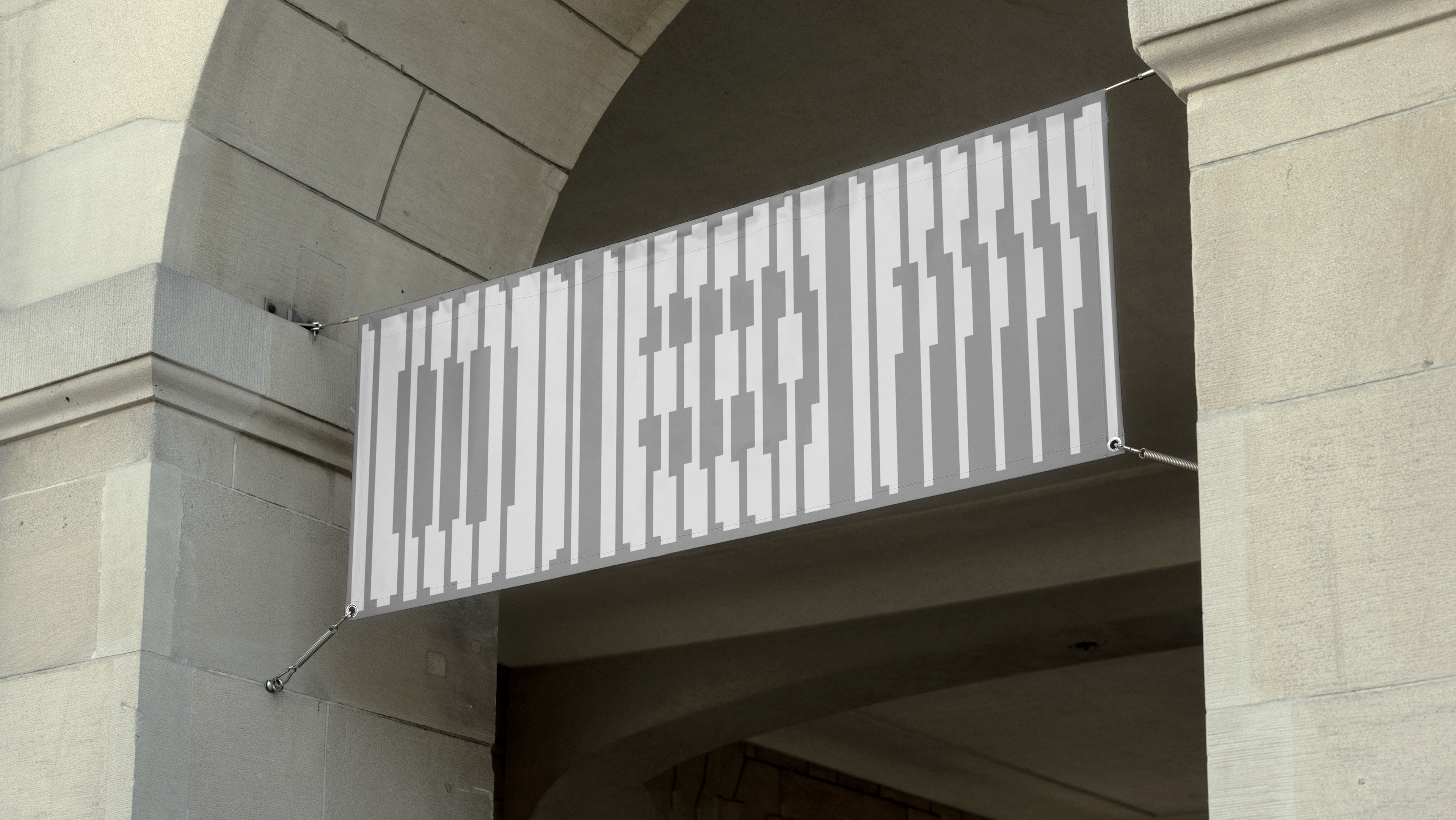
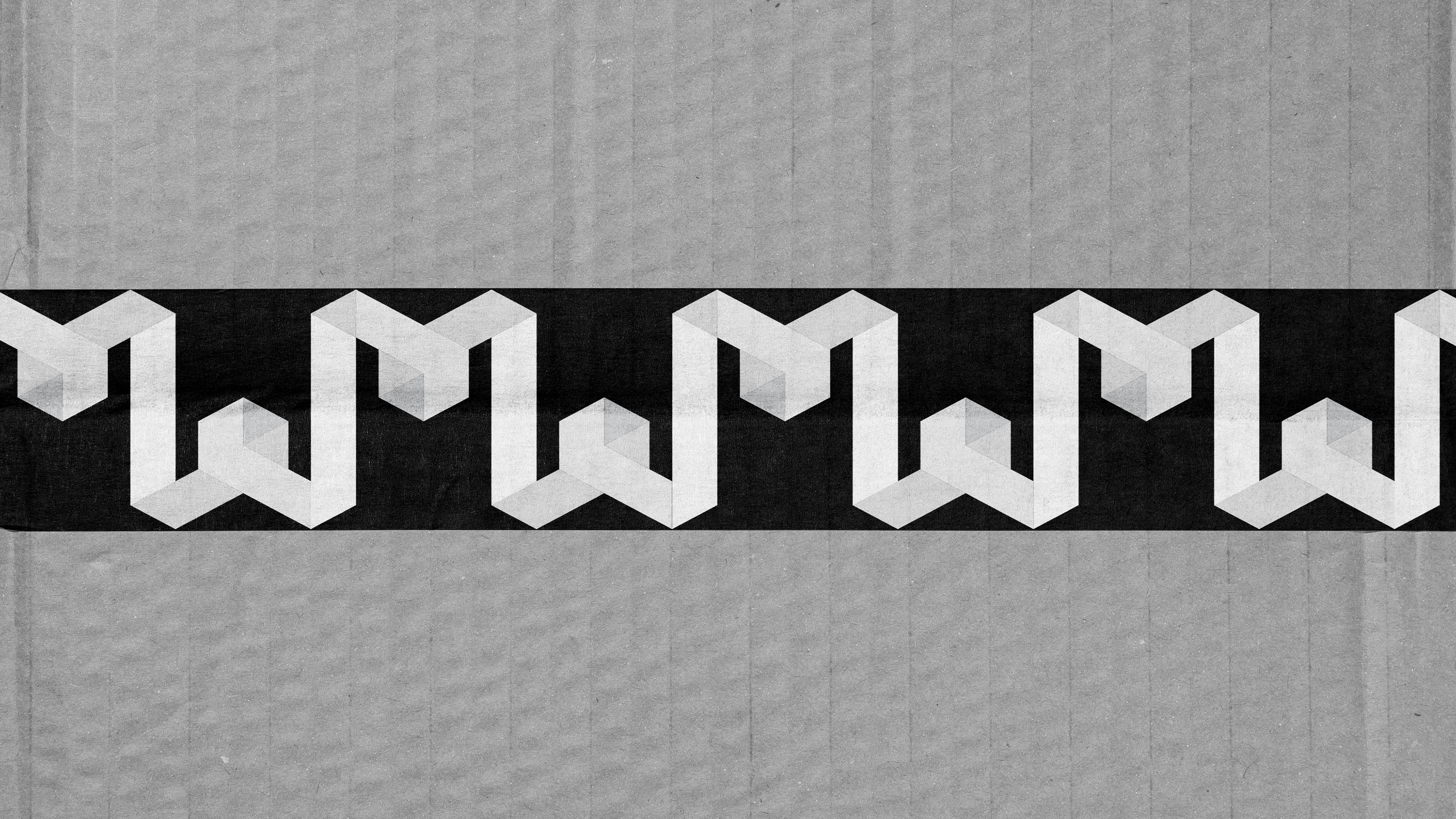
A new stencil version of the logomark was created so that it can be sprayed on their fine art crates and used for their business stamps. The new signature logo print, which shows their monogram interlocked with an inverted upside-down version, was designed for their fine art packaging tape.
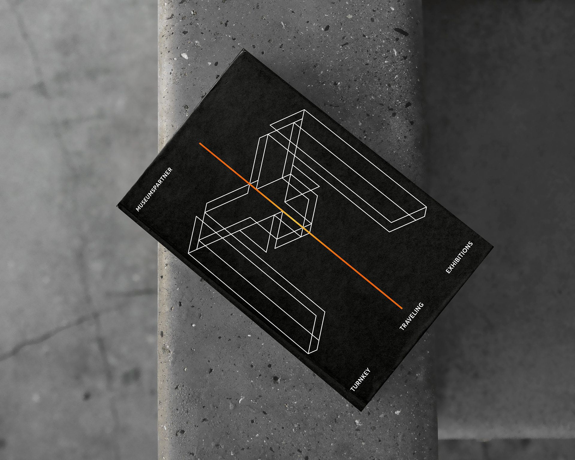
A special logo version was created for their travelling exhibitions.
The tagline “Wir bewegen Kunst” and its variation “Kunst in Bewegung” were developed to promote their fine art transport services in Austria, Germany and Switzerland.
Art storage campaign For this campaign, they wanted the orange line to be a slightly thicker underscore.